Today was the first rotation day for the different subjects within ‘Design and Media’. Today was all about ‘Visual Communication Design’, which is one of my interests to go into when I pick a pathway, so I was very intrigued with this.
The session started off with explaining about what comes under ‘Visual Communication Design’, which were subjects that I didnt even think would be. It was interesting to know what pathways within ‘Visual Communication Design’, that there is aswell. I only really know about photography, and I really want to learn new things, so I am extremely excited for the progression of the course.
After the short presentation, we went off to find materials to create ‘Emotive Type’, I have documented everything from this session in my sketch book as-well. We had to create 3 3D or 2D (but at least one 3D) letter A showing different a different emotion. I did find this a little out of my comfort zone, as I haven’t ever done anything 3D before, as I very much digital, so I find this quite a challenge, as being put on the stop for this made it harder seen as I haven’t done 3D before. I did try my best, and I did actually enjoy doing it, it was so different than staring at a computer. I created 2 3D designs, and I am still currently working on my digital and drawing letter, I am doing an extra one as I wanted to experiment more.

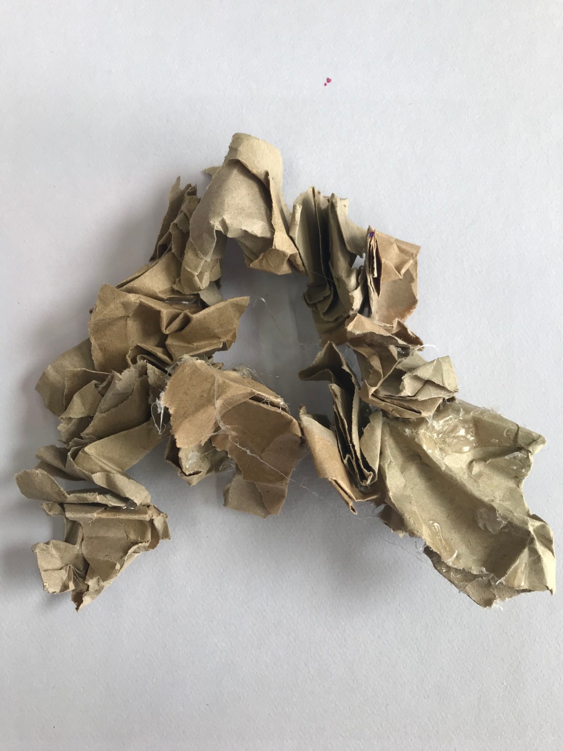
The photograph above was my first attempt at doing a 3D A. The emotion behind this was anger. It was anger because of the crumpled up paper, which is what some peoples faces look like when they are angry, and also some people feel the need to squeeze things, such as a stress ball, when they are angry to try and calm down. The brown colour paper shows the blank expressions that people give in anger, when they are trying not to show that they are angry.

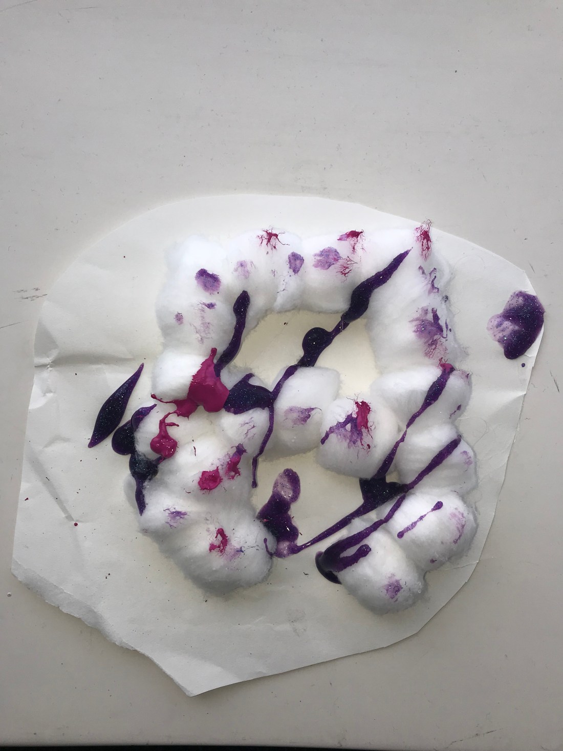
The photograph above was my second attempt at doing a 3D A. This letter A was to show the emotion surprise. This is shown through the surprise in the paints over the cotton balls, and that the paints have glitter, and mostly surprises use glitter as a symbol of trying to shock someone. I was using a hot glue gun to stick the cotton wool balls together, and they get stuck to a piece of paper underneath, and as it was involving a hot glue gun, and the cotton wool balls were small, I didn’t want to risk getting burnt so I kept the paper underneath. I was waiting for the paint to dry and then I was going to try and cut away the paper, but the paint didn’t dry in time, which was unfortunate.
I haven’t got the two other letters, but I will add a picture when they are complete.
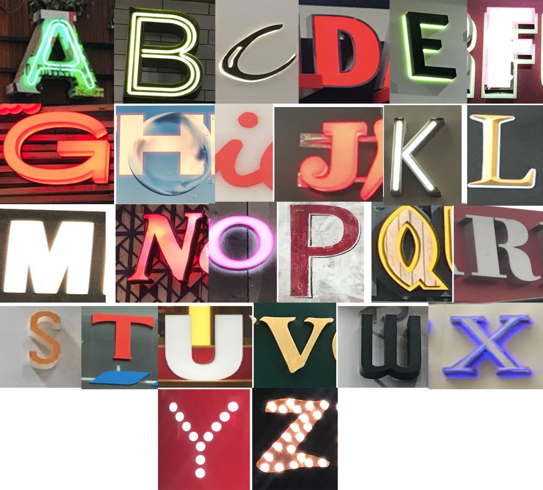
For the second session of the day, we done something called ‘Archive Type’, where we traveled around the area and photographing different fonts, letters numbers and symbols to create the alphabet, and having one font for each letter. I decided to take a picture of all the signs I could see, and when I got to picking the letters, I had a variety to choose from. I have included all of the photograph logo typography signs in my sketch book.
This is the final image collage of the alphabet font:

I have done a few edits on photoshop just as some experimentation, as I am considering this subject as a pathway so I wanted to do some extra work to build up my knowledge. There are a total of 6 different edits, but they have been grouped together to make the presentation of my blog easier.
I will also be doing numbers and symbols, doing some edits of them on photoshop too, and doing some research behind typography and the subjects that we covered today as I would like to expand my knowledge.
When all the work has been completed, I will be adding another blog page for all of todays work, but keeping it separate from tomorrows sessions work. The titles will be separate too.


