Today was the first day of the Lens Based Media. Today was all about photograph. It was completely different to how I did Photography at GCSE and A -Level, but it was interesting to know different perspectives about how to do things in photography.
We got set a task before we came to the class about finding an artist that using light and shade. I found a photography named ‘Kumi Yamashita’, The photographs below are the photographs I chose to bring to class.
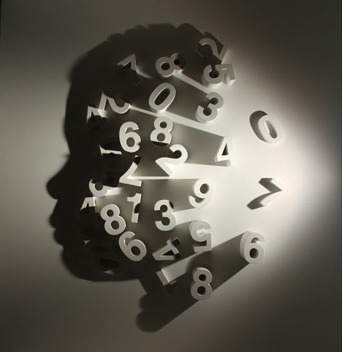

I really liked the photographer because it is so interesting, as there was hardly no shapes, but the light forms an image. I really like the first photograph because it creates a head from the alphabet, using light and shadows. We had to place our photographs that we brought in on the wall. The group decided to put it in two straight lines, however, what I didn’t know is that it’s all about presentation and how you present your work on the world. The work was then rearranged on the wall and ended up looking like this:
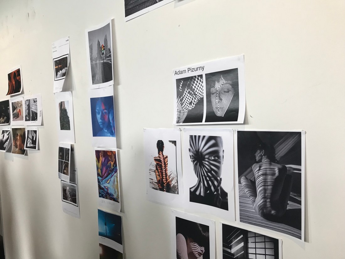


This was the process of everyone going sorting out the artist photographs. I don’t think I got a photograph of the actual finish product, only certain groups of the photographs.
The second project was to purposely take bad photographs, we had half an hour to do this. I did find it difficult as I normally always take photographs with a theme, and there wasn’t a theme only taking bad photographs. These are some of my photographs:
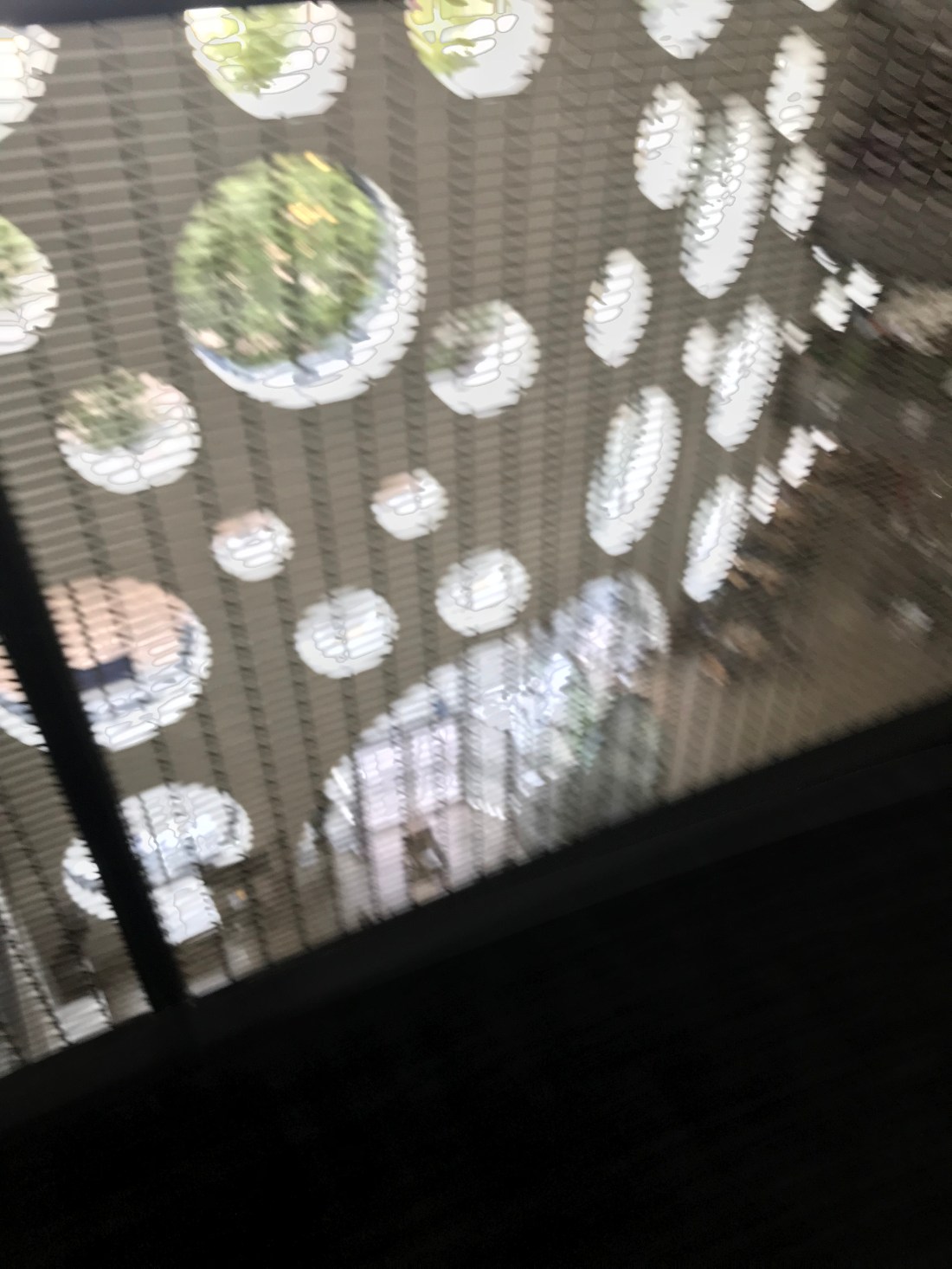


Even-though they are bad photographs, they are quite interesting as I was making them purposely bad. However I think the blurriness makes the photograph unique and different.
These are the photographs of the layout before and after:
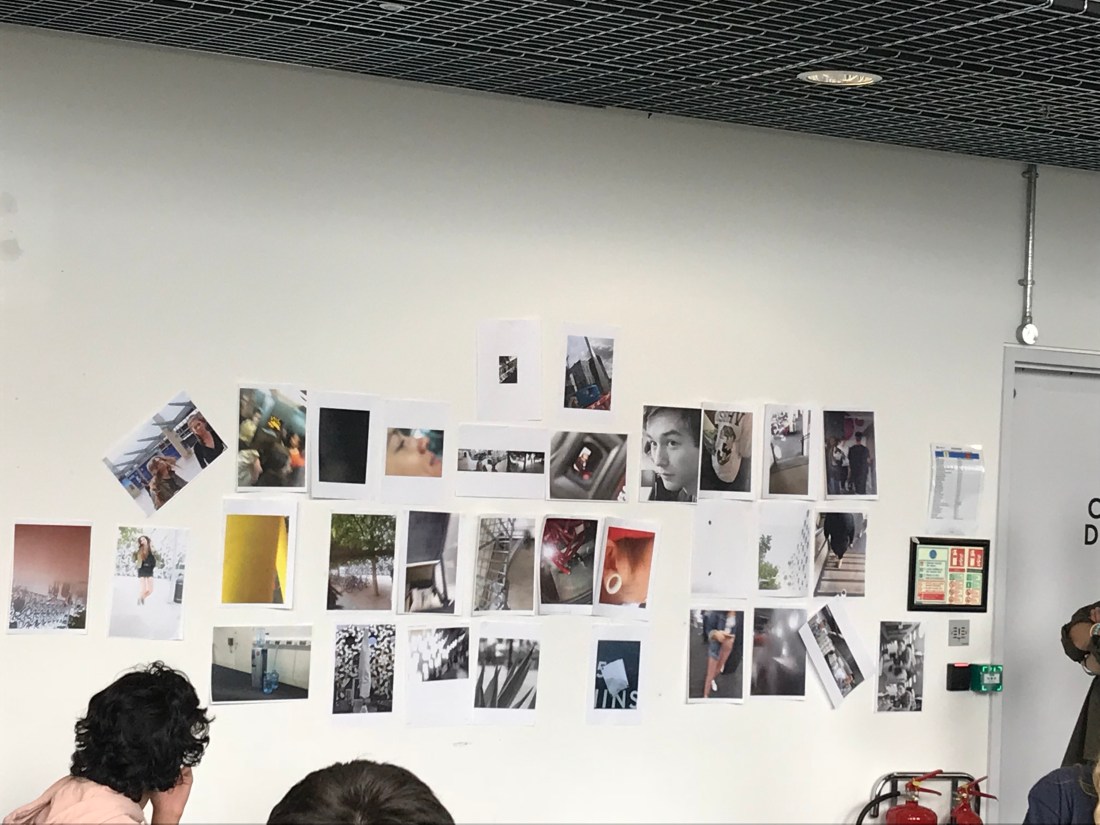

I think that the second layout went a lot better than the first layout. The second layout was all grouped with similar themes, and it was all to tell more of a story than just putting a photograph in a random place on the wall.
I think the morning activities went well, I have learnt how to present a piece of work on a wall in an appropriate way, and a way that it can tell a story. When presenting work in a room, or a wall, everything matters, space, lighting or even the layout of the photos in a group or singular.
For the afternoon activity, we had to take some photographs using themes from the following list below:
- Lighting – Natural and Ambient
- Texture and Pattern
- Interior and Exterior
- Street
- Documentary
- Portraiture
- Fashion
- Shadows
- Framing of an image
I completed a lot of themes that were on the list. I am going to include my favourites ones on the blog, and put the rest of the photographs in a contact sheet in my sketch book.


These photographs involved shadow and texture. I liked these because the shadows on the floor were from noodles that are on the 02, and they are interesting to watch when the move and create abstract shadows. The tree looked really interesting because you can see the texture of the bark, but the pattern on the tree is continuous across the whole area of the tree.
I found this session really useful for learning how to present, and layout photographs. It will help for in the future when trying to present my piece of work.
For tomorrow, I will be planning for my brief for creating a narrative using 6 photographs. At the moment, I think I am going to concentrate on portraits and their expressions.
