The first thing that I done today was to make sure that the Lino cut was deep enough around the black lines. I thought that would help when I print onto the paper.
These are the photographs of my steps that I took:
These are the steps I took:
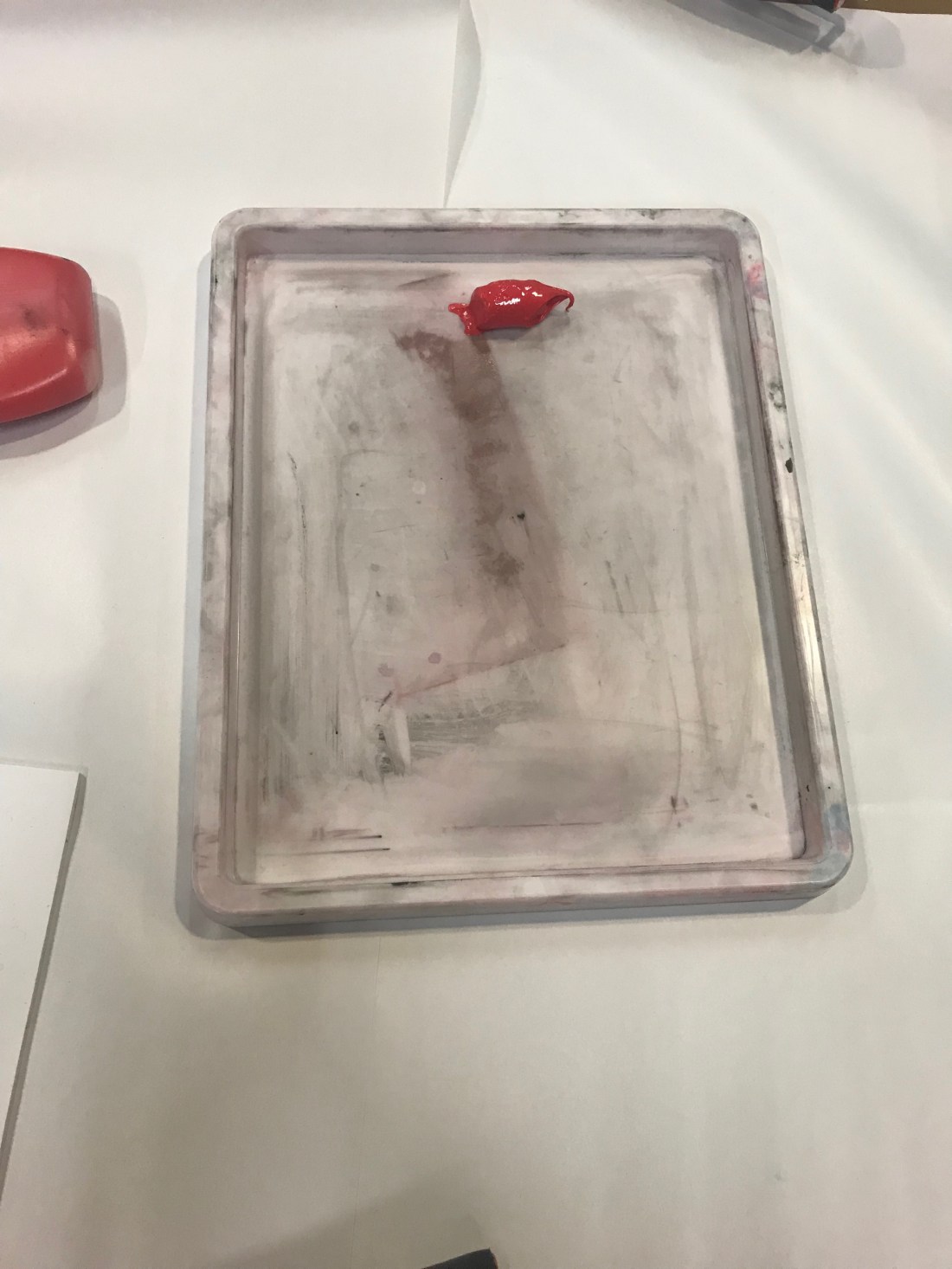
- I decided I wanted to use red, I didn’t want to use black and white as I felt the design wouldn’t of been as effective as a bright colour such as red. First what I had t do was put the ink into a tray.
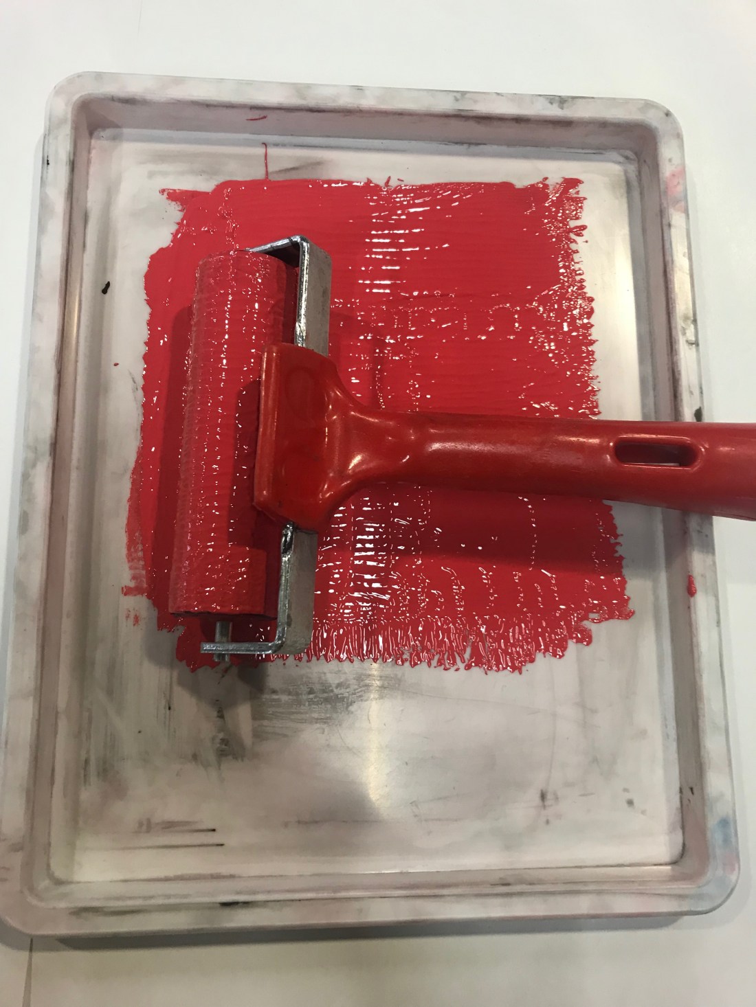
- I had to roll the ink out across the tray, going in different directions to spread the ink out, but making sure that there isn’t a lot because with Lino printing, less is actually more. As it is being stamped, the more ink would make it it gooey and that wouldn’t make the stamp look good.
- Using the same roller, and this was a repeated action, I had to roll the ink onto the Lino, a few times to make sure the design had a layer of ink so that when It went to printing onto paper, I was able to have the whole image being stamped properly.
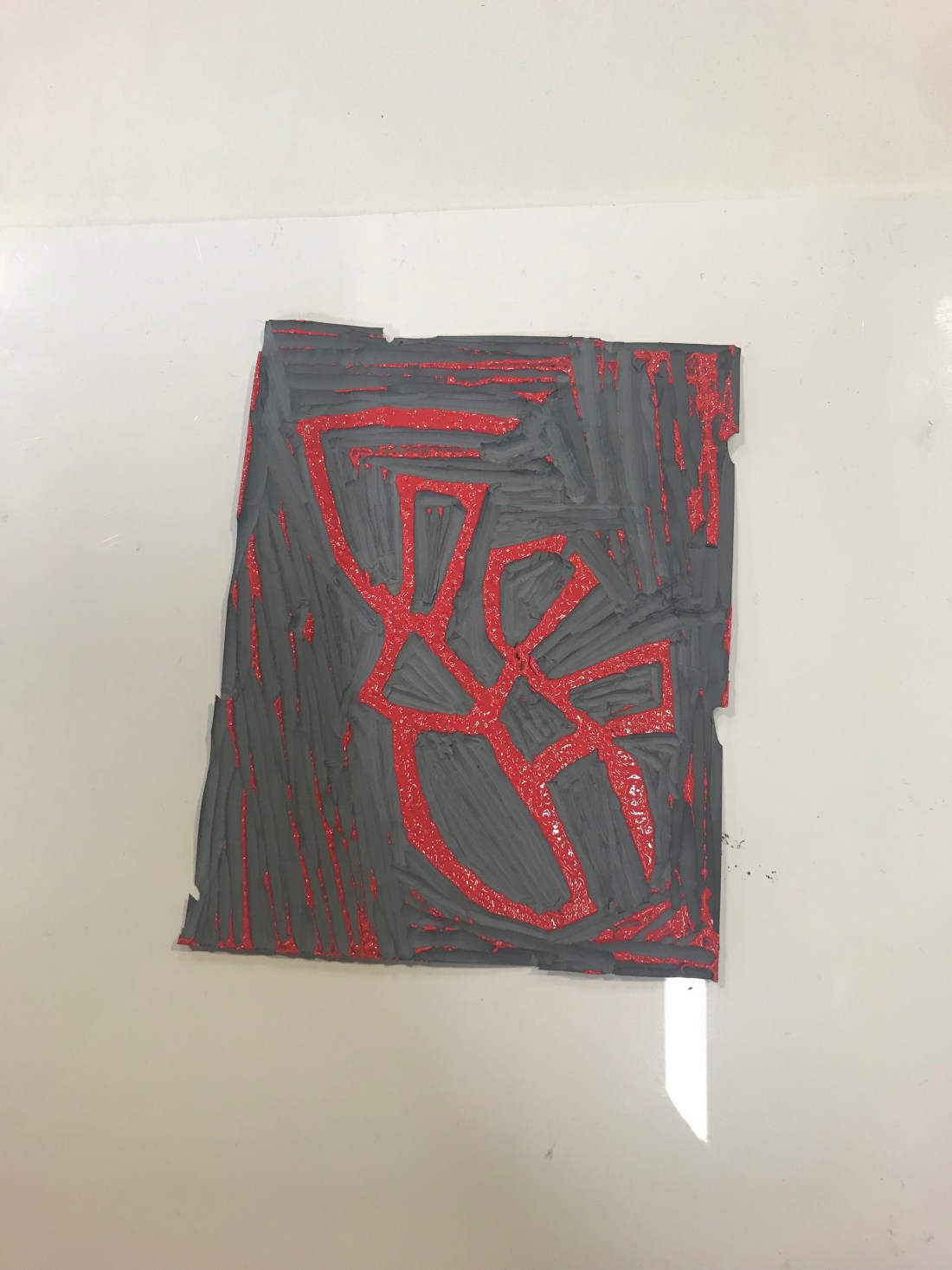
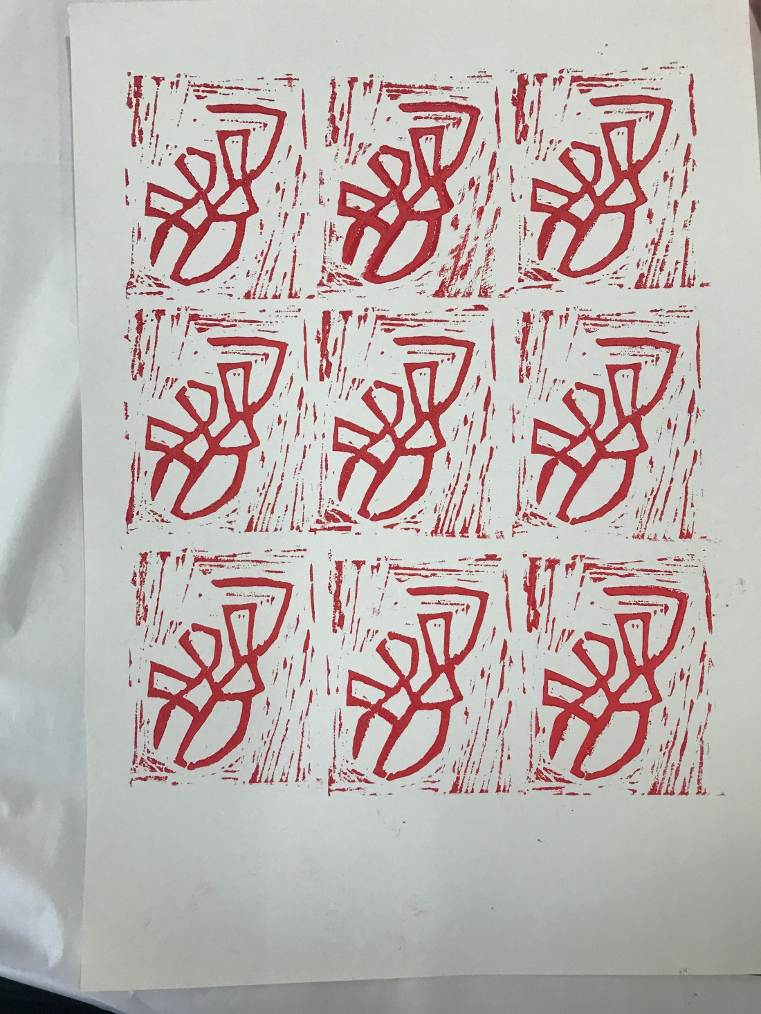
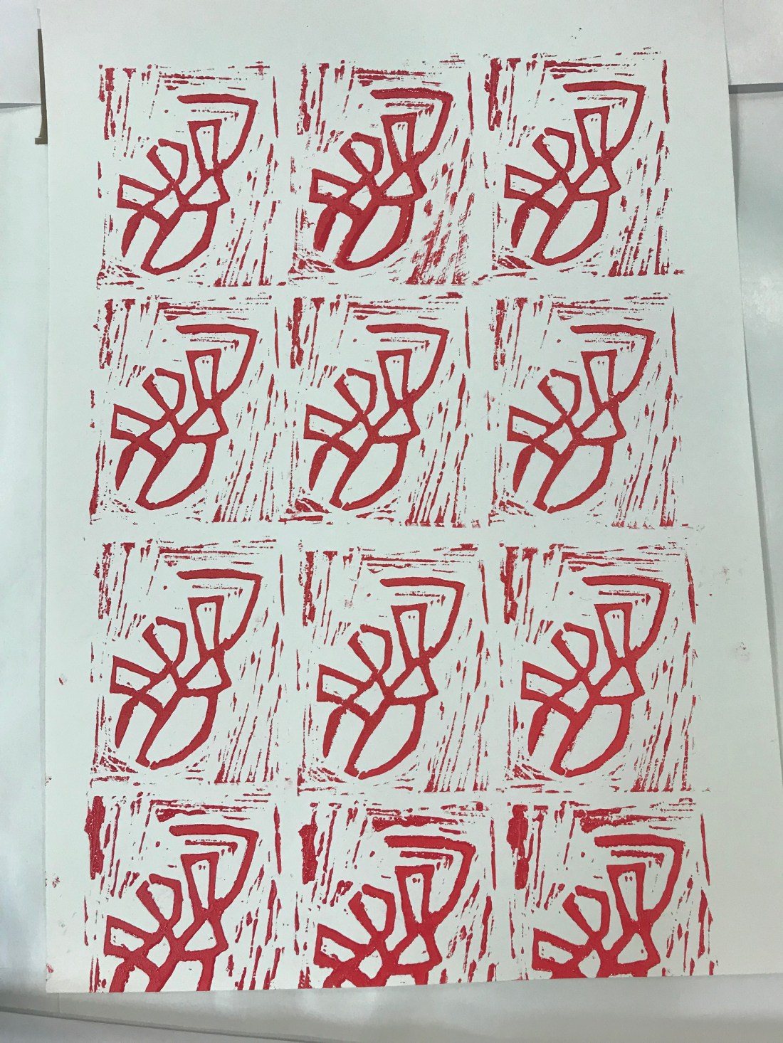
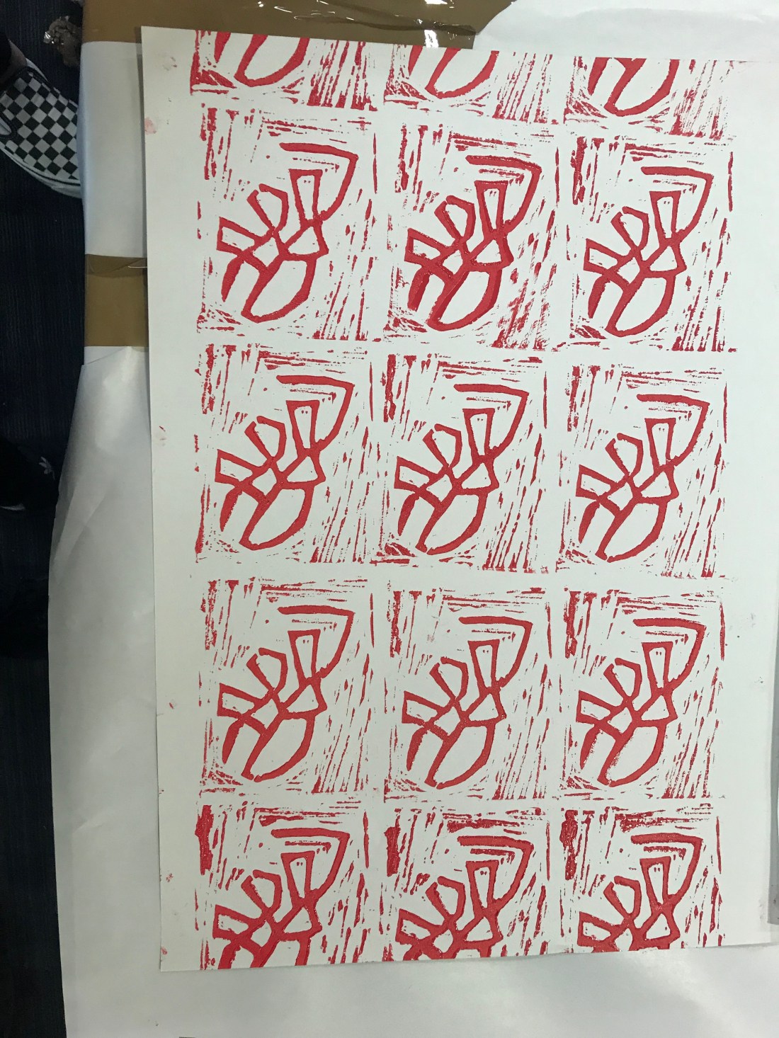
- The fourth picture is showing what the first Lino printing looked like, I really liked it, it looked so good. I didn’t even realise that the outside would be so prominent but it actually makes the stamp better I feel. Sometimes mistakes can actually help the design process.
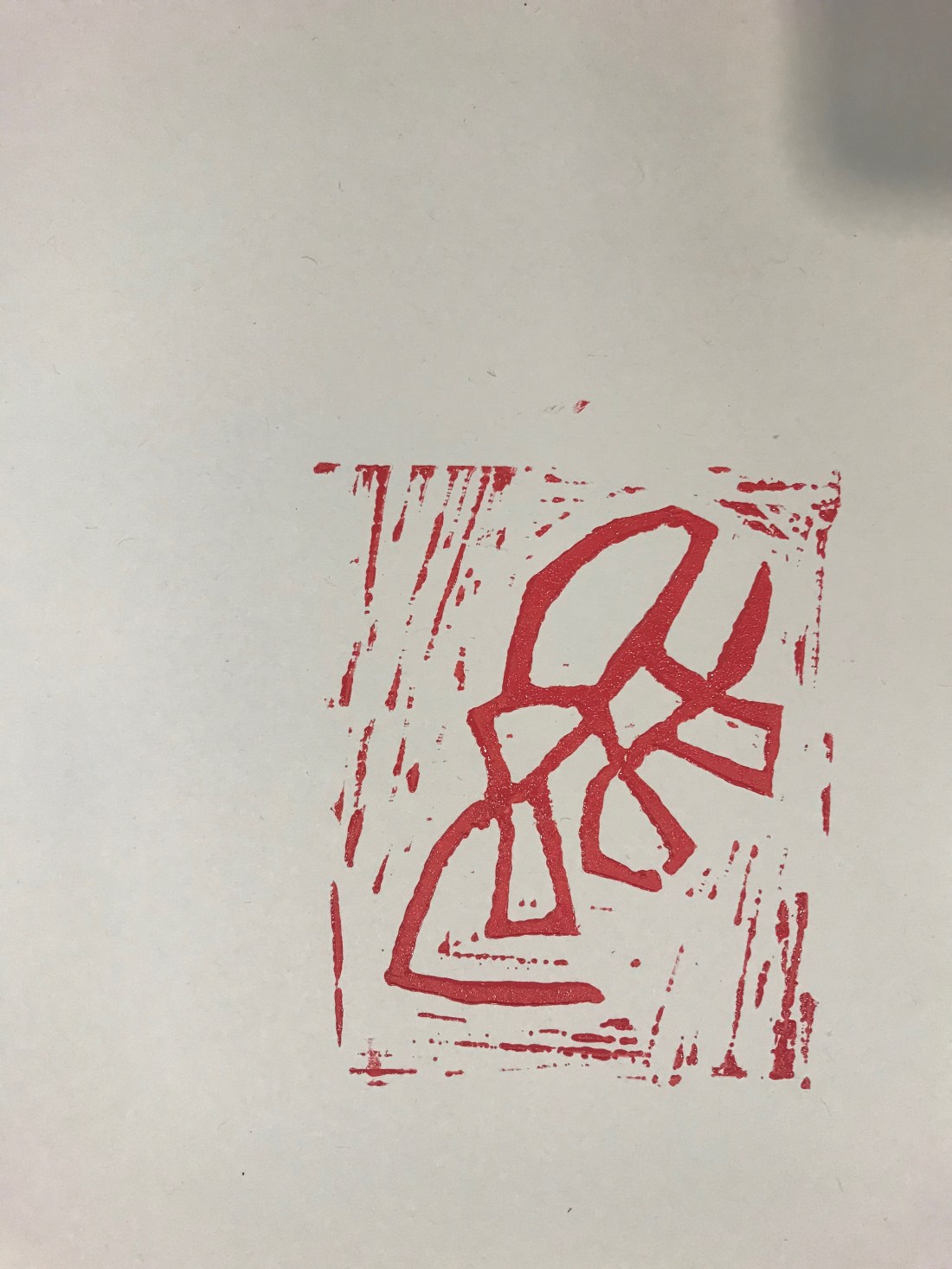
- Photographs 5, 6 and 7 were all different ways to finish the end paper. One was filled, one wasn’t filled around the ages and one was taken landscape. The landscape one actually looked better, and I preferred it landscape to portrait as well as the Lino printing was landscape instead of being portrait.
I have never done Lino printing before, and I really enjoyed it. It was a new experience for me and I have learnt a lot about how I can make sense different from what I started to do.
