Thursday 8th November

The start of the day was too do a group critique. We got separated into groups, and we were showing our work. There was a spreadsheet on google sheets that we wrote 3 positives and 3 point of actions for each person. We ended up doing it in pairs as it was a group of 7 of us, and we felt it was easier to talk amongst two people. The points that I was given was

3 Positives:

  • Not overthinking the design process. This is one that I gave myself, and I wanted it to be recorded. I am always overthinking the design process ever since I joined the Foundation during the diagnostic stage. This is because I was so worried about how my work compared to others, even though I shouldn’t, because everyone has their own style of work, but I felt really embarrassed by it. However, during the entire book making process, I went with the flow, I didn’t overthink and I felt that it made my book so much better as I was concentrating in the moment instead of the final product.
  • The designs connected with the manifesto. This is what one of my peers gave me as a positive critique. One of her comments was that the images related to what the manifesto was saying and the images looked visually good. The example she gave was how when I was comparing black and white to colour, the manifesto was saying the same thing, and it looked like it flowed together which is what I wanted, and I am quite proud of myself for that. I am happy that the critique happened as it really helped me.
  • Writing over images. On the end page of my manifesto I have a paragraph of writing quite spread out over the page, and underneath is one of my images. I changed the opacity so that most were visible in the same area and I actually really like it. I think it looks good the last page. However, on the front page, the same thing has been done but in a different part of the page, the image is underneath the writing but towards the edge of the paper.

3 Points of Action:

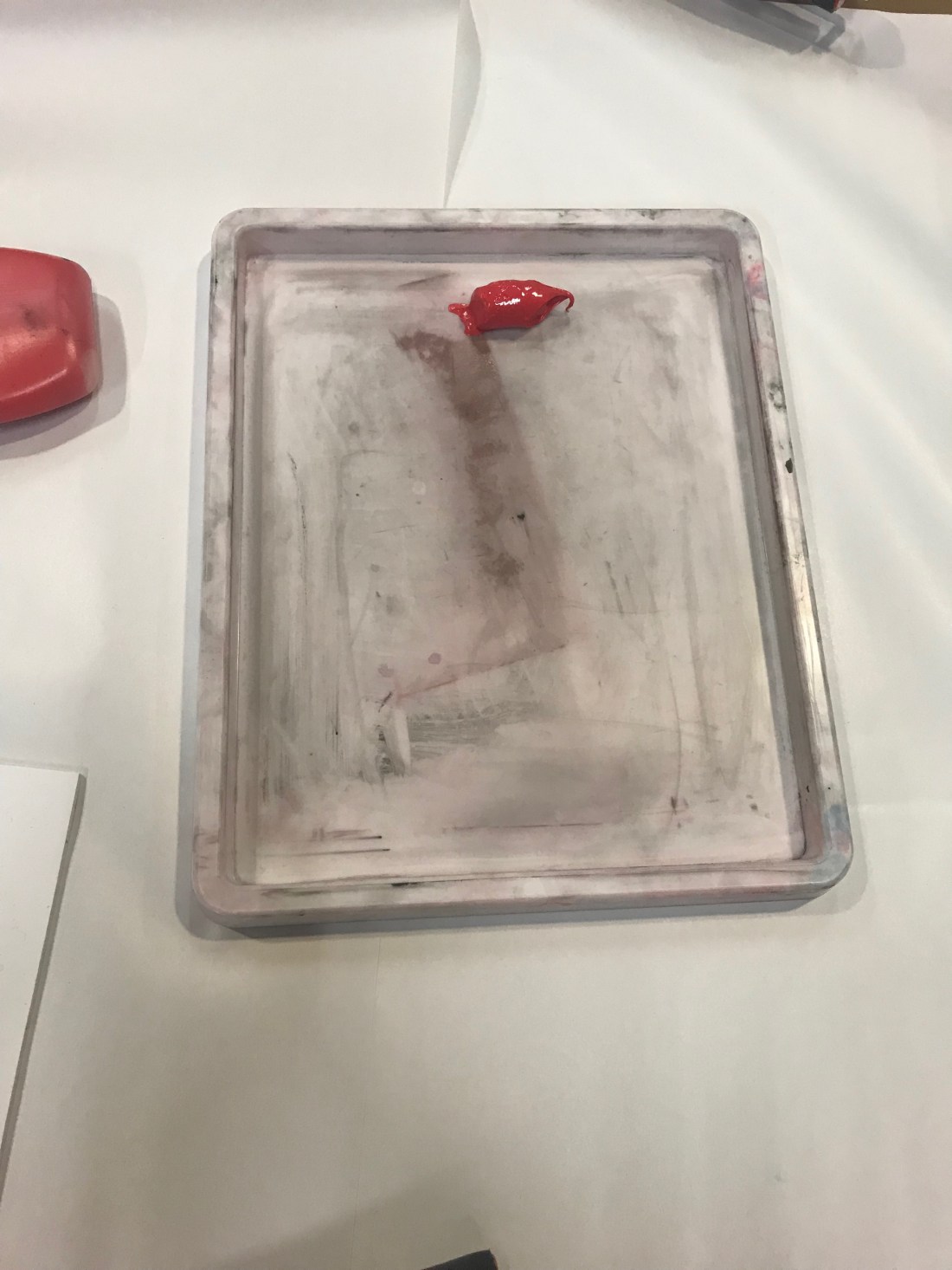
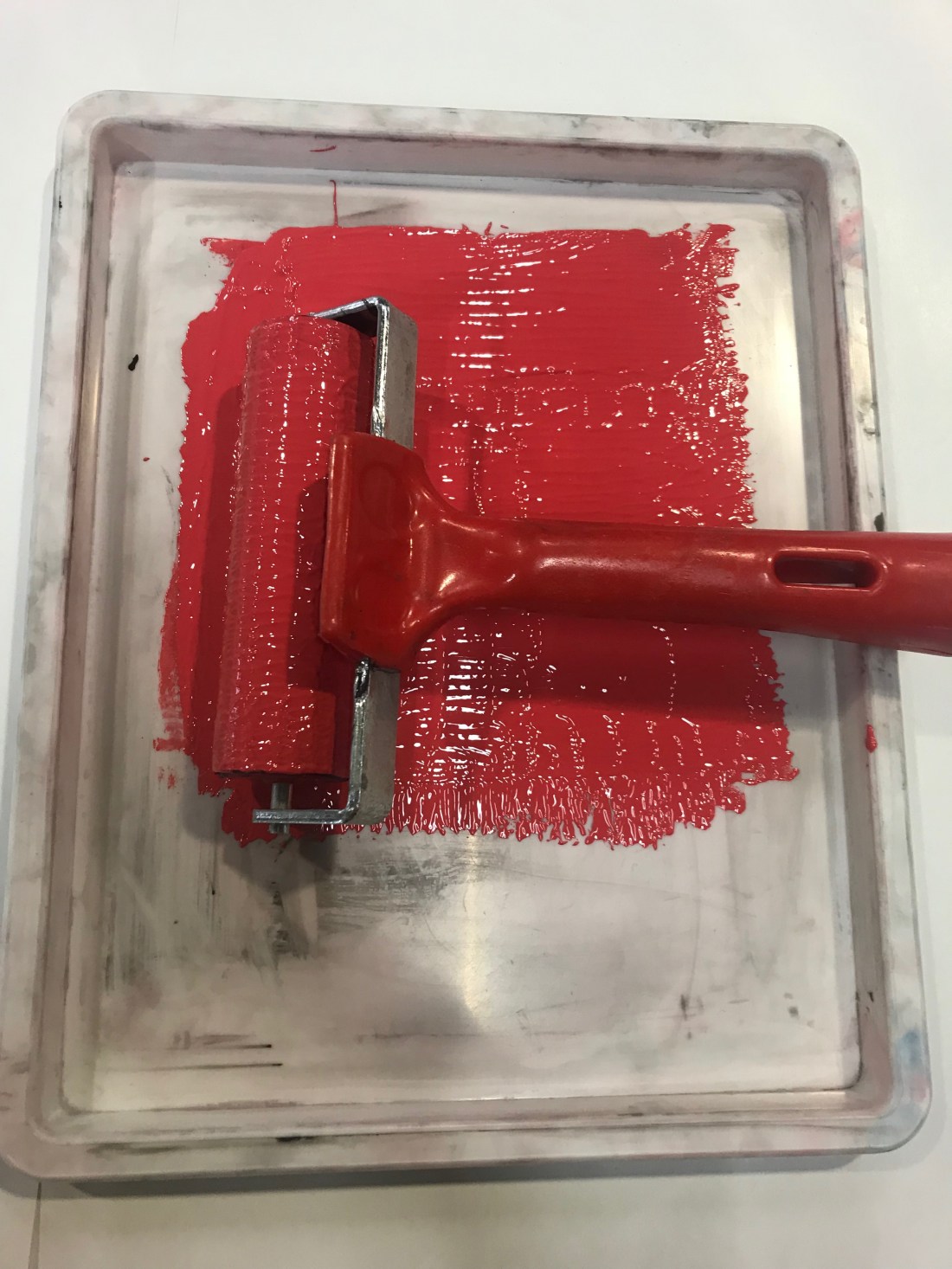
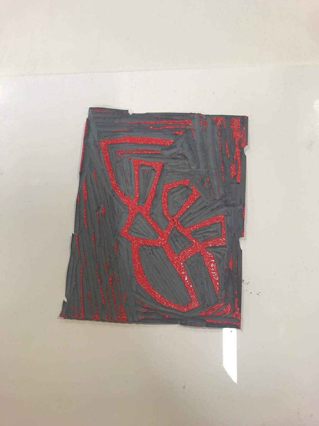
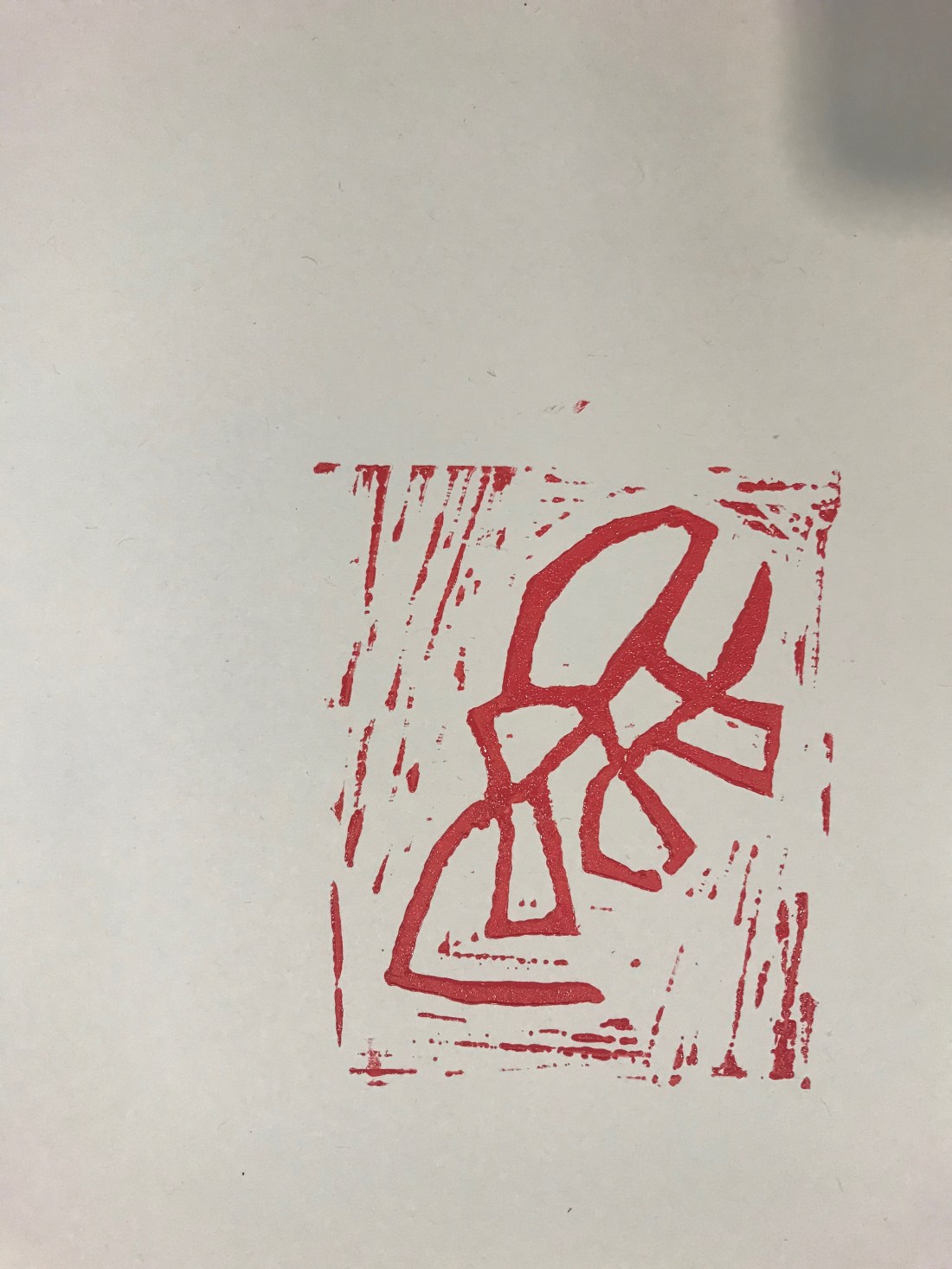
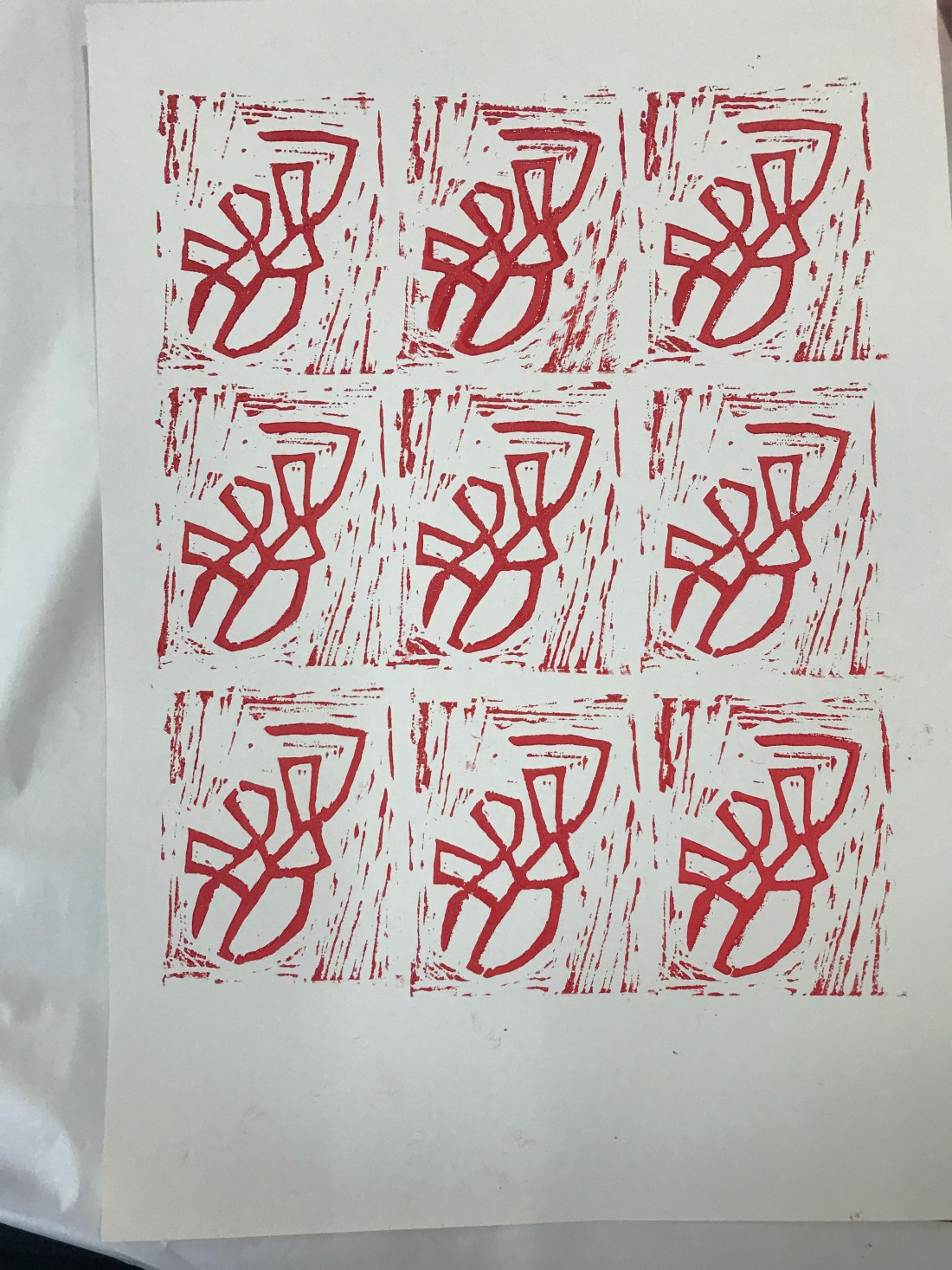
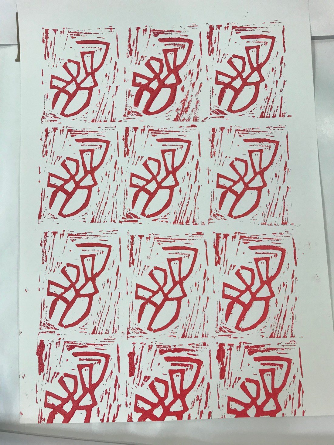
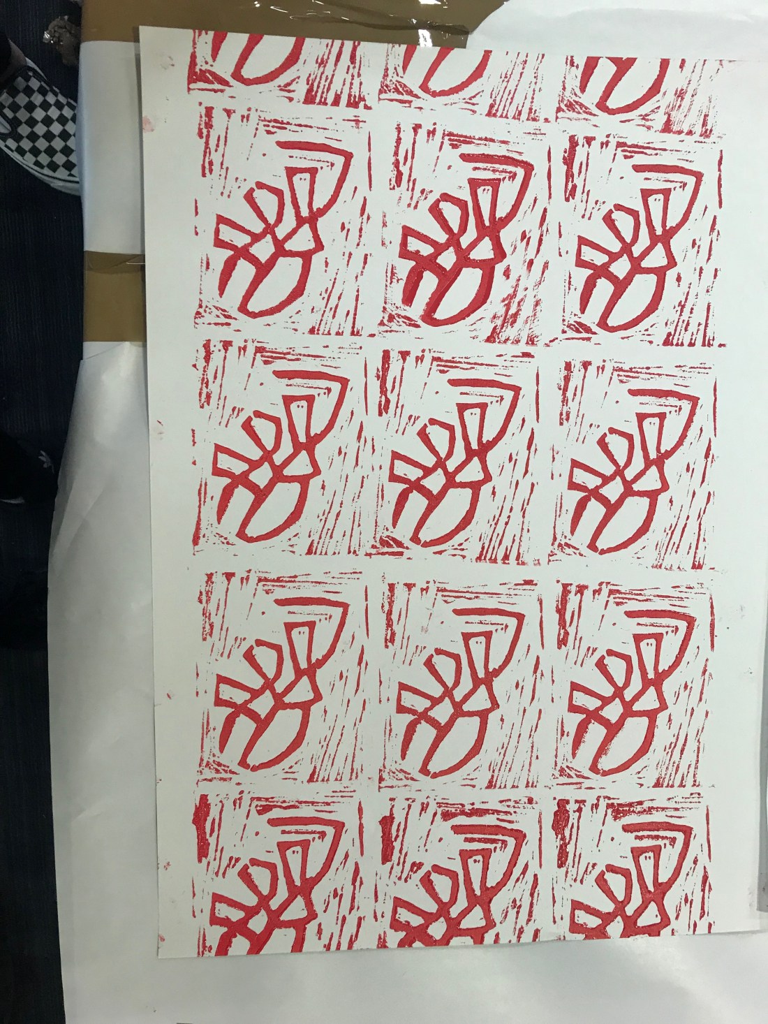
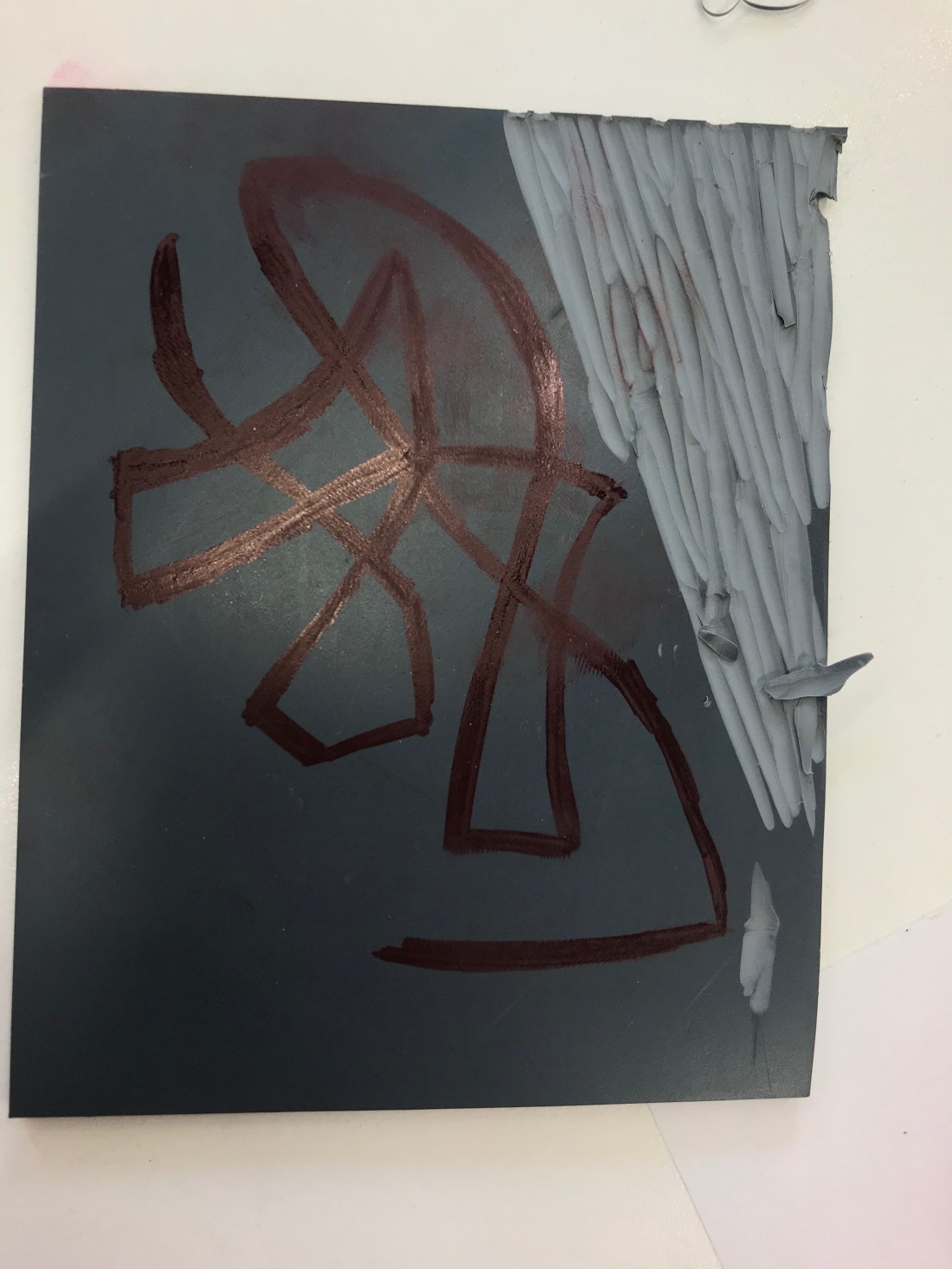
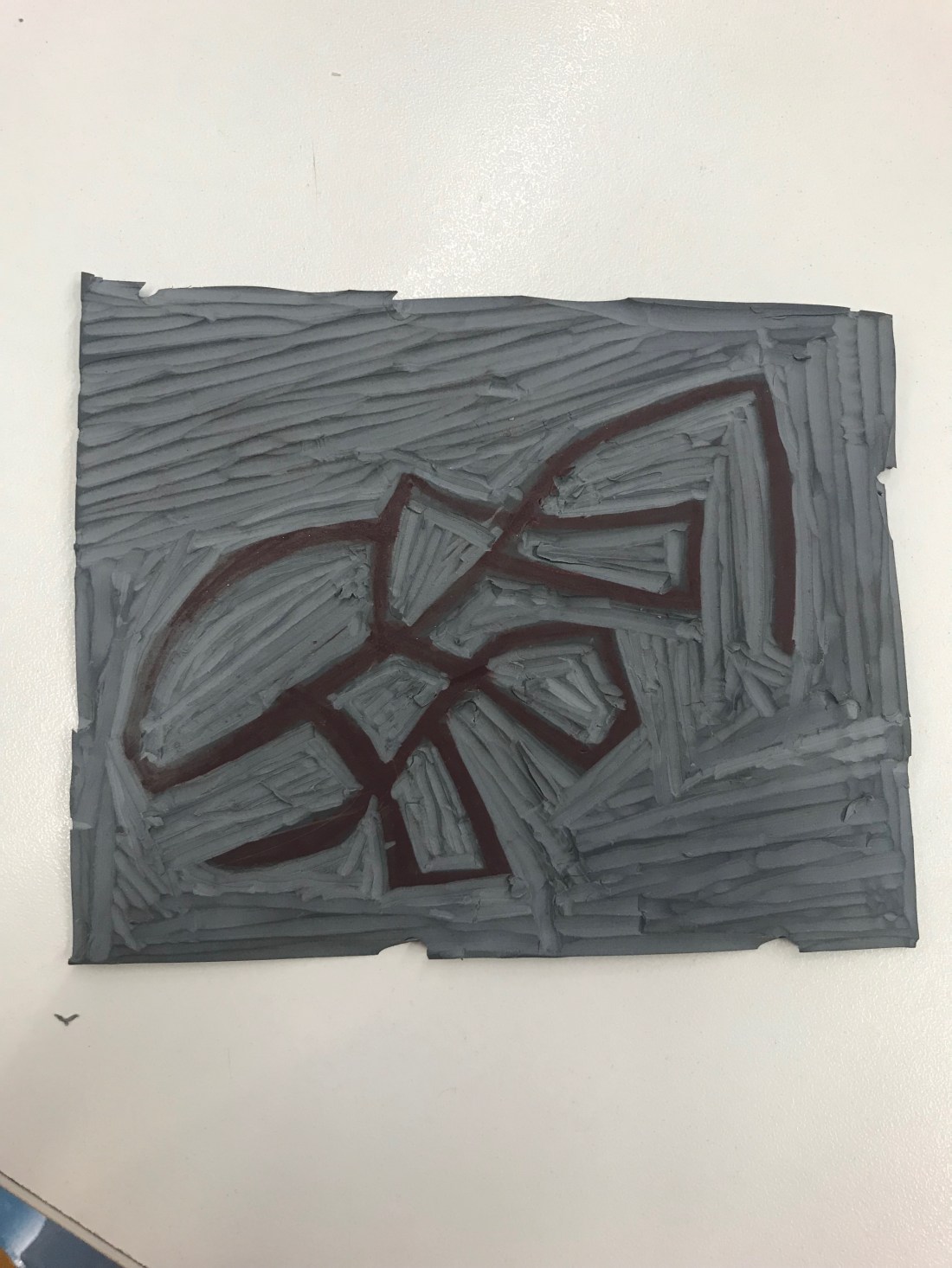
  • End Paper. While doing the Lino printing, I think I was using too much ink on my stamp, and therefore the ink was taking an extremely long time to dry. When the book came together, the end paper kept sticking together and when opening the book, there was a struggle, and then the paper did kind of rip and there are a few patches where the paper has come apart. It makes end paper look a little bit scruffy. Therefore, when it comes to making my next book, or even creating Lino printing, I will make sure there is barely any ink on the stamp as the saying goes ‘less is more’.
  • Drawings. I have always known I am extremely digital within my work, I enjoy creating digital images using photography or creating images on Illustrator and Photoshop. I thought that I could expand on my digital skills and try actually drawing some images if I were to do it again, or even in the future. Just to try and practise my drawings by hand as I know that it isn’t my strong suit. I do want to try and learn how to be a better drawing because I feel like it could improve my thoughts as a designer.
  • Layout. I am good at laying out the design on a page in a typical format, however if I want to be noticed for my designs, I think that creating different, unique and unusual page layouts would make the page look more interesting, and different that it would grab peoples attention.


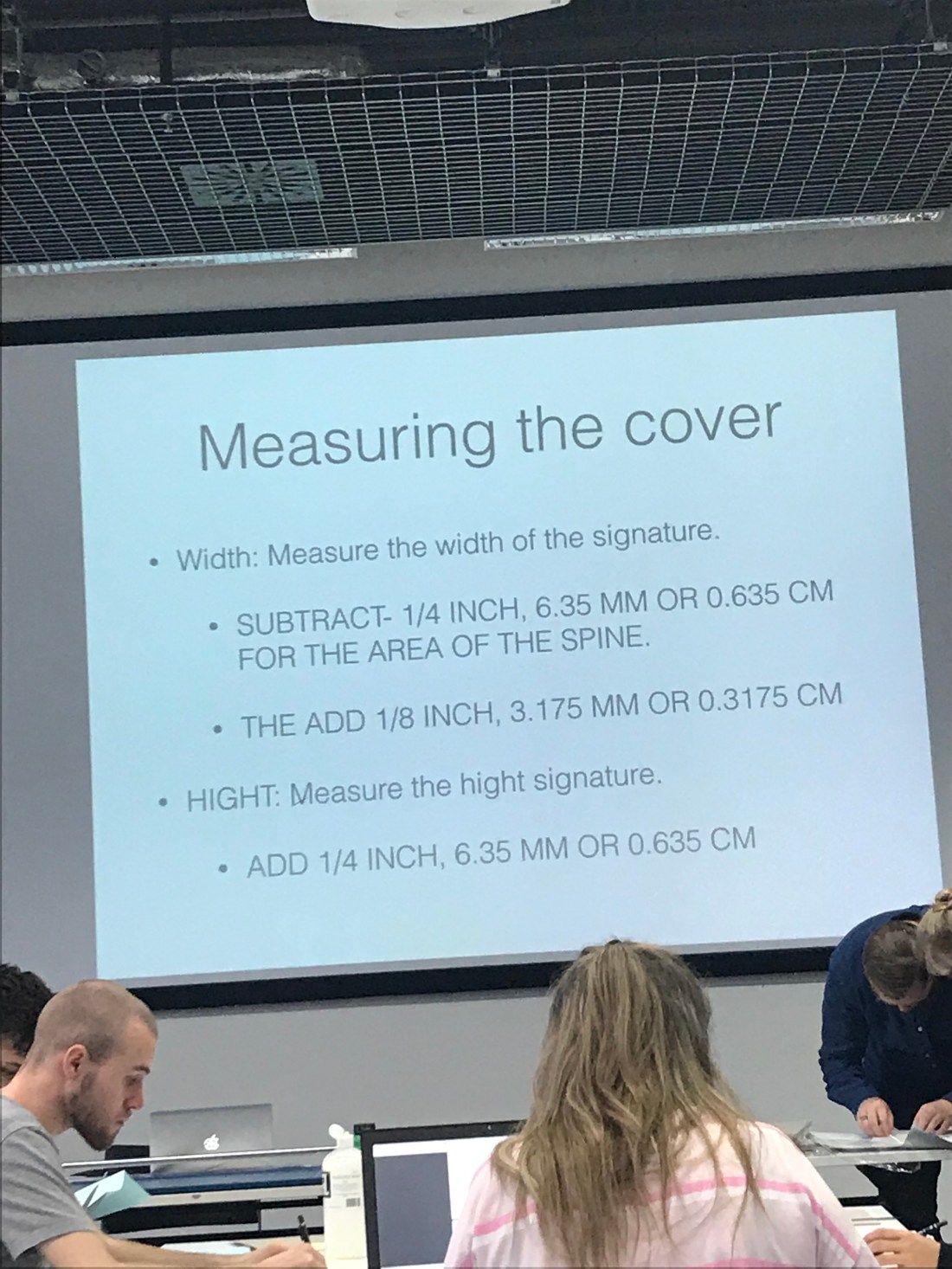
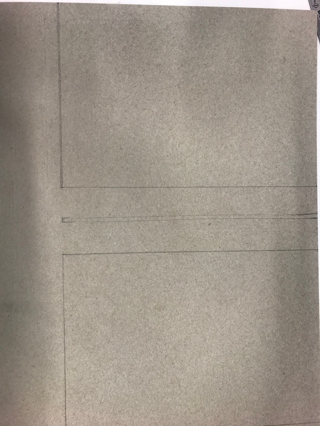
The next part of the session was to create a dusk jacket for the book. This was created on  Illustrator. This was difficult as I had to change the measurements of the booklet after the first printing, to be able too fit my booklet correctly. I wanted to be free within the design so I didn’t think about it at all. I just went with the flow. This is because this was part of my design manifesto to not overthink a design.

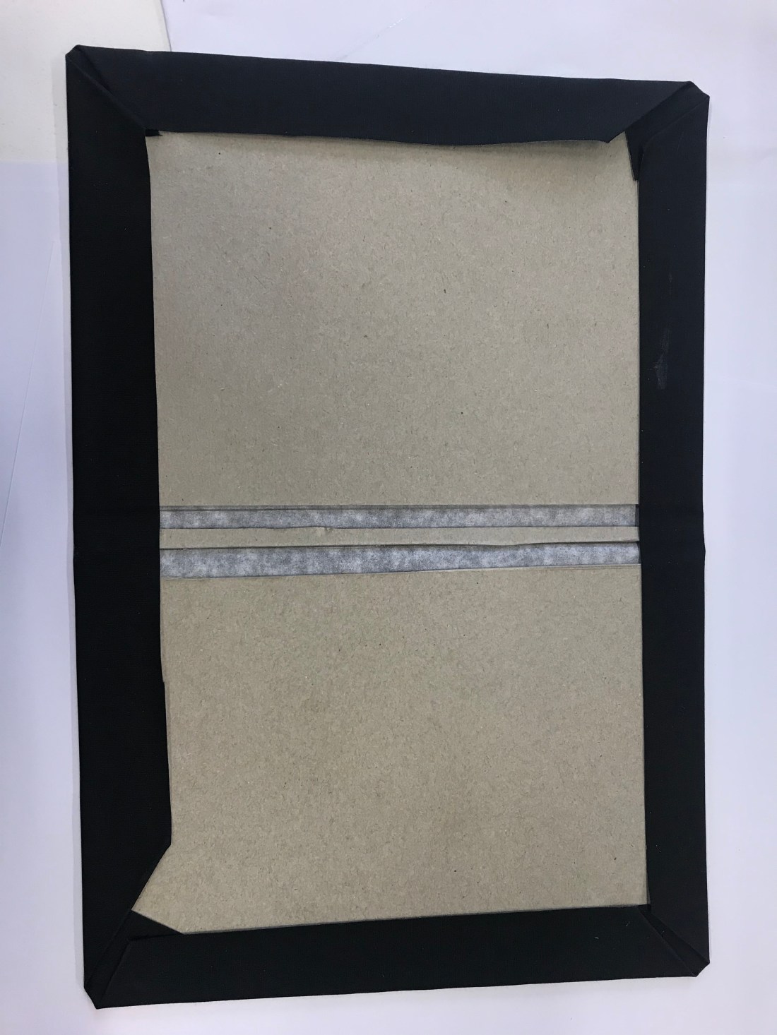
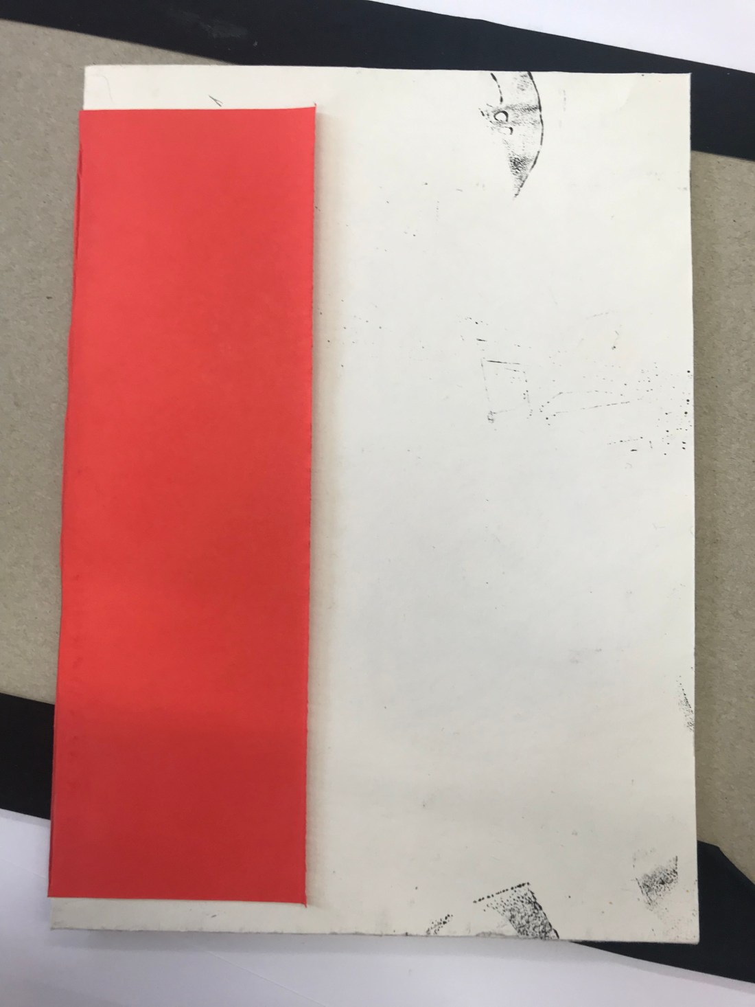
The way the design cover looks is that they are both front covers. I wanted this techniques because it seemed different. The two pages are completely different, and this enabled the reader to think about what is going on on each page. I just felt like having two covers looking like they are both front covers was unique. I made sure that I used the same colour scheme.

I did enjoy doing this because I enjoy designing covers. I only had about an hour to do this, so it wasn’t as good as I would of hoped for if I had a lot more time. If I had more time, I was thinking of doing drawings and scanning them into using them on my front cover because that was part of my 3 actions to do for the future of creating a book.


Tuesday 6th November

To start the day off I wanted to cut off the excess of my end paper because my booklet was a5, but I was using a3 paper for the end paper. I had already PVA Glued the end paper together. My tutor actually explained to me that you can use a Stanley knife and a cutting mat with a metal ruler, and actually cut down the excess. It was quite interesting to learn something completely new. I was really surprised, but I was so happy that I was able to make the edges very smooth using a Stanley knife. The photographs below are showing how the book looks.

The next task was to get a scrap piece of coloured paper, and cut it down so it was smaller than the A5 book. Using a very little bit of PVA glue, glue down the middle of the coloured paper (I chose red), and then stick the book in the middle and gently close the book together, making sure everything is touching the glue, including the seam, just so that the book has some extra support.


IMG_1255

The photograph above is the measurements needed for the creating the book cover. This was quite difficult, and I did struggle with this. However, I did receive help which I appreciated, and because it was a one to one help, I felt like it helped me a lot more than when it was the demonstration.

IMG_1256.JPG

These were the drawings of the book cover, and then had to be cut out via a Stanley knife, and a ruler. The board was quite thick so I did have trouble trying to make sure the line was straight against the ruler as I had to press down quite hard to get the knife to actually go through the board.

After the board has been cut out, I put it onto book cloth. I decided to go with black book cloth because it matched my end paper of red and black, and there wasn’t any red. I then had to stick the board onto the inside of the book cloth, making sure I didnt get any PVA glue on the black side of the cloth, then I had to measure the spine depth, and add 6mm to the measurement. This create the two images above. It was to help when the book had a lot of pages in it. The book didnt actually need to have a spine because of how thin, and because there was barely any pages, but it was a good thing to learn for future references.

IMG_1263.JPG

To get to the photograph above. I had to measure the book cloth around the edges so all of them were 3cm. This way we were able to create the library corner. The corner was bent into the book, all four of them, and then the edges folder over. To create to cover over the board, and create the book cover.

After this, we were to stick in our book very carefully. The extra support with paper we used we had to stick down which is shown in the photograph below:

IMG_1264

After this was one, I layered a small amount of PVA glue on the front and back cover of the booklet and carefully laid it into the book cover. This then created the book. I left it at uni so that it was able to dry and the glue did react to the ink of the end paper design, and it went through the paper and it became quite messy.

The next task is to creating a dust cover which will be happening on Thursday.

Monday 5th November

The start of todays session, we were giving an hour and a half to print off our manifesto layout, these are the selection of images that I created. I did create more than 10, but that made it easier to decide which images I actually wanted in the booklet. I have to take a picture from my phone of the images as I can’t seem to add the documents into the blog. However they are in my sketchbook.

This was my manifesto, again I had to take the photographs from my phone of the screen, but there is an example in my book aswell.

I did have quite a lot of issues with printing because we were using our own paper so we had to se the bypass tray from the printer, and we had to figure out how to use it. Also I had a personal problem where someone had logged into their account over my printing and the printing prioritised the other persons work and my work stopped printing half way through, so I had to go to IT and get a refund. This took away quite a lot of time.

We did have an hour UCAS talk to talk to us about personal statements and universities. I learnt that I am guaranteed a place at Ravensbourne which was really good to know because I am really feeling about coming here. I feel so comfortable and I love coming here on the foundation course. I am really enjoying it.

After the break that we had, we had to actually bind the booklet together using thread and a needle. We had to message 2cm from each side, and then measure the middle of the 17cm line which was 8.5cm. This create 3 points where we would make the holes. Once the holes were made, we put thread into the needle. then closed the thread around the needle, and used a Pretzel Stitch. Go in the middle hole over into the left/right, then over into the other left/right then back out into the middle and it binds the book together.  I then tied it together and it created a book.

After this, we got our end papers, and very lightly PVA glued the bind of the book and folder our end paper so the design was hidden and stick it on the front and back of the book. But only gluing the edge of the booklet.

This was the end result:

Tomorrow I will be cutting down the end paper so it matches the actually size of the booklet.

Thursday 1st November

Today we had a talk from one of the lectures on the Graphic Design BA, talking to half the group about page layout. I have researched about page layout,


The second part of the day was practising how to print of a booklet, there was multiple different steps onto doing this. This is the step by steps:

  1. Press File – Press Print Booklet
  2. Preview – Print Settings
  3. Setup – Paper Size – A4 / A3 (if using a3, add crop marks)
  4. Orientation – Landscape
  5. Click Scale to Fit
  6. Printer/Set Up – Two Sided
  7. Short Edge Binding
  8. PRINT

These steps were easy to follow, but there is so much to remember, so it becomes more confusing.


These are the screenshots from my practise, I will also be putting the practice booklet into my sketchbook:


How I found the day:

Was it helpful?

What did I enjoy?

What can I improve on?


Tuesday 30th Ocotober

The first thing that I done today was to make sure that the Lino cut was deep enough around the black lines. I thought that would help when I print onto the paper.

These are the photographs of my steps that I took:

IMG_1145.jpgIMG_1147.jpgIMG_1149.jpgIMG_1150.jpgIMG_1152.jpgIMG_1154.jpgIMG_1155 2.jpg

These are the steps I took:

  1. I decided I wanted to use red, I didn’t want to use black and white as I felt the design wouldn’t of been as effective as a bright colour such as red. First what I had t do was put the ink into a tray.
  2. I had to roll the ink out across the tray, going in different directions to spread the ink out, but making sure that there isn’t a lot because with Lino printing, less is actually more. As it is being stamped, the more ink would make it it gooey and that wouldn’t make the stamp look good.
  3. Using the same roller, and this was a repeated action, I had to roll the ink onto the Lino, a few times to make sure the design had a layer of ink so that when It went to printing onto paper, I was able to have the whole image being stamped properly.
  4. The fourth picture is showing what the first Lino printing looked like, I really liked it, it looked so good. I didn’t even realise that the outside would be so prominent but it actually makes the stamp better I feel. Sometimes mistakes can actually help the design process.
  5. Photographs 5, 6 and 7 were all different ways to finish the end paper. One was filled, one wasn’t filled around the ages and one was taken landscape. The landscape one actually looked better, and I preferred it landscape to portrait as well as the Lino printing was landscape instead of being portrait.

I have never done Lino printing before, and I really enjoyed it. It was a new experience for me and I have learnt a lot about how I can make sense different from what I started to do.


Monday 29th October

Today was the first day of Visual Communication Design.

The first big of the session was going through the brief, understanding what we are going to be doing for the new two weeks in terms of book binding, and creating a book from out manifesto and 10 designs. I thought this really helped understand what is expected of me for the oncoming weeks, and the one cut book that we created with all the information we needed, really helped me over reading week when I looking at graphic design, and what the subject was about.

After the 45 minute talk about the brief, we were asked to go the library and research 10 artists and 10 different end papers. The end papers that I found were from the library and these are the following:

scan_96635918_2018-10-29-10-30-15scan_96635918_2018-10-29-10-29-52scan_96635918_2018-10-29-10-21-21scan_96635918_2018-10-29-10-20-52scan_96635918_2018-10-29-10-20-02

These are links, I am not sure how to include the actually images.

These are some of the book ends that I found on Google:

I liked the above end papers because they seemed so detailed, and this meant it would of took a very long time to actually create them, especially if they were using Lino.

These are the 10 artists that I found:


After we starting design a logo to use for our end paper, I got some rough paper to practise some designs on what I was actually going to do:

IMG_1133.jpg

The scribbles are actually blind drawing. I learnt this technique during the experimental stage and I actually loved it. It follows my manifesto about not thinking about what I am drawing, and just look forward to what it may bring.

This is my process of the Lino Cutting:

IMG_1136 3.jpg


IMG_1138 3.jpg

IMG_1143.jpg

My Lino was actually supposed to be portrait, but I decided it looked better landscape, and when I looked, the Lino cut actually looks like an ant and I really loved that because it was unexpected and was done accidental through my blind drawing.

Tomorrow session is going to be Lino Printing which I am really looking forward to. I haven’t overthought the process yet, and I am really proud of myself because I am following my manifesto, the way that I was supposed too.

1st Developmental Stage – 19.10.18

During the developmental stage when going through all the different subjects – with majority of them being subjects I have never done before, I learnt a lot. I had my weaknesses and strengths throughout all the different subjects, but I ended up learning a lot about the approach that I take to get to the final product with all the subjects.

I know I had a strength in photography because I studied the subject for GCSE’S and A-level. I really enjoyed the subject, and I would have carried it on but I felt like I needed a change. I wanted to be able to learn new things. The only adobe software that I knew how to use was Photoshop, but due to being able to download free software. I have downloaded Illustrator and InDesign so that I could teach myself how to use them like I did with Photoshop. The software tutorial that we had was so helpful in actually understanding the basics of Illustrator and InDesign. I know that my strengths are in digital work, such as editing, taking the photographs and create designs such as posters, leaflets, and covers for albums. I like doing this in my free time as well, however I am concentrating on actually learning illustrator for the moment.

During the whole experimental experience, I had a lot of doubts about myself, I realised that with all the new subjects I really struggled with the drawing element, I have always known I was not a good drawing, and I always felt embarrassed because when looking around the room, there were so many people that had amazing work. I know that everyone has strengths and weaknesses, but it was hard. I am practicing my drawing as I feel like this is important. I did try drawing on Illustrator and I felt that it worked so much better than drawing. It was a little cartoon character but I was just drawing free hand using the pen tool, and the outcome was quite good. Another weakness that I had was creating 3D objects, I have never done any work 3D before, so this was really challenging for me. I kept overthinking everything that I was doing, and creating more of an issue for myself which could have been prevented. Although I struggled, I did enjoy the challenge, but it was just upsetting when I couldn’t block out the overthinking because I was worried about embarrassing myself with my drawings. I know I shouldn’t do that, and I know that everyone has different ways of approaching design, and I have grown and moved on from this.

I have improved on a few skills, I feel like that because I worked my entire summer holidays I was able to improve on my confidence and socialise with people, which due to my past I wouldn’t have been able to do it as well as I actually have. I felt that I have fitted in with people very well, and I am glad as when you socialise and get a group of friends it makes the experience less overwhelming and slightly more enjoyable. I feel like I am able to work as a group, I have never worked as a group behind, and during the past month I have done things that I never thought I would such as being myself with an entirely new group of people, and I am proud of how I have coped and how I have put 100% effort into all of my work.

I wanted to do graphic design as when I search and researched the subject, it really interested me because through the course I am able to explore so many different ways of designs, learning new skills and gaining experiences. The skills that I would learn would allow me to expand on my knowledge and help me understand design a lot better than I actually have learnt throughout photography and media. I know it has only been a couple of days, but I have read through the brief, and what I am going to be able to do, and what I have already done; I am really enjoying it, and I am really looking forward to what the year has to offer me. A designer in graphic design which really interests me is Gemma Obrien, I found her page on Instagram, and it looks so unique. The photographs are all taking really nicely, and the layout makes you want to dive into her work. The actual work itself is amazing. I spent hours just looking through her Instagram, and thinking about the work she has designed, and how it makes me feel as a viewer, but also potential artist and it made me thinking of how I want my style / tone to be. It hard to say what it will be at the moment, but I am thinking. It is interesting to think that they aren’t any limits in term of design, and the saying ‘The worlds your oyster’, really connects with design itself.

I am going to set a challenge for myself to try and go to different exhibitions, even if they aren’t graphic design, I don’t want to limit myself, I want to look at inspirations / artists work in all the different areas and hopefully be able to combine different skills. I aim is to not overthink, to practice my drawing skills, and just have fun with the projects. They are creative projects, I want to be able to think outside the box with them, enjoy them.

Thursday 4th October – Photographs

IMG_0737.JPG

I have had to put the photographs on a seperate blog because I wasn’t able to upload them to the other blog as it bugged out, I did leave it a while and refreshed but it didnt work. I didnt want to not include my work as I thought making a new page would be better.

I really did like our work.  I thought that we really worked well as a team, and we were able to bring different approaches together to create something extremely bright.

In the end I did enjoy this task as I was able to engage with new people, and able to improvise when something didnt go exactly the way we had planned for it too.