Today we had a study skills lesson for half an hour from 10:00AM until 10:30AM. It was an extremely fast presentation about note-taking and note-making, time management and some key points onto how to make a blog. It was quite often, but it would of been better if the session went a bit slowly and in a lot more detail, but there was no information about Harvard referencing or about the essay which I thought it was about.
Tuesday 18th September
Today was the first day of the Lens Based Media. Today was all about photograph. It was completely different to how I did Photography at GCSE and A -Level, but it was interesting to know different perspectives about how to do things in photography.
We got set a task before we came to the class about finding an artist that using light and shade. I found a photography named ‘Kumi Yamashita’, The photographs below are the photographs I chose to bring to class.
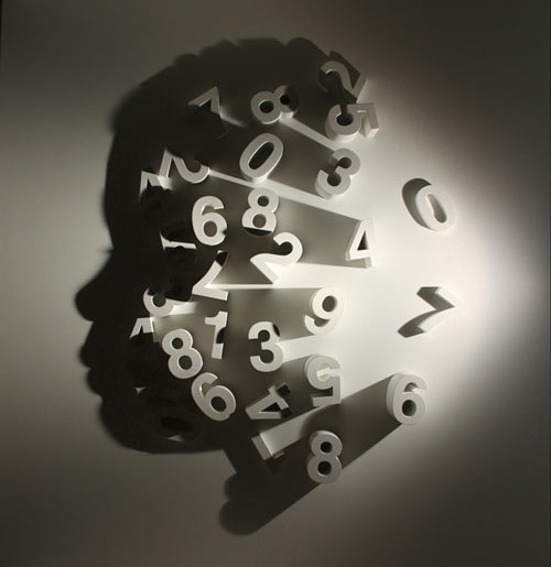

I really liked the photographer because it is so interesting, as there was hardly no shapes, but the light forms an image. I really like the first photograph because it creates a head from the alphabet, using light and shadows. We had to place our photographs that we brought in on the wall. The group decided to put it in two straight lines, however, what I didn’t know is that it’s all about presentation and how you present your work on the world. The work was then rearranged on the wall and ended up looking like this:


This was the process of everyone going sorting out the artist photographs. I don’t think I got a photograph of the actual finish product, only certain groups of the photographs.
The second project was to purposely take bad photographs, we had half an hour to do this. I did find it difficult as I normally always take photographs with a theme, and there wasn’t a theme only taking bad photographs. These are some of my photographs:


Even-though they are bad photographs, they are quite interesting as I was making them purposely bad. However I think the blurriness makes the photograph unique and different.
These are the photographs of the layout before and after:
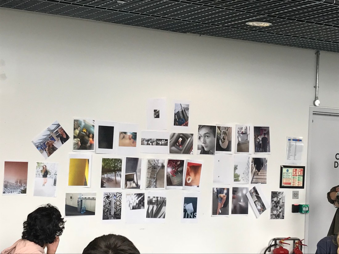

I think that the second layout went a lot better than the first layout. The second layout was all grouped with similar themes, and it was all to tell more of a story than just putting a photograph in a random place on the wall.
I think the morning activities went well, I have learnt how to present a piece of work on a wall in an appropriate way, and a way that it can tell a story. When presenting work in a room, or a wall, everything matters, space, lighting or even the layout of the photos in a group or singular.
For the afternoon activity, we had to take some photographs using themes from the following list below:
- Lighting – Natural and Ambient
- Texture and Pattern
- Interior and Exterior
- Street
- Documentary
- Portraiture
- Fashion
- Shadows
- Framing of an image
I completed a lot of themes that were on the list. I am going to include my favourites ones on the blog, and put the rest of the photographs in a contact sheet in my sketch book.


These photographs involved shadow and texture. I liked these because the shadows on the floor were from noodles that are on the 02, and they are interesting to watch when the move and create abstract shadows. The tree looked really interesting because you can see the texture of the bark, but the pattern on the tree is continuous across the whole area of the tree.
I found this session really useful for learning how to present, and layout photographs. It will help for in the future when trying to present my piece of work.
For tomorrow, I will be planning for my brief for creating a narrative using 6 photographs. At the moment, I think I am going to concentrate on portraits and their expressions.
Monday 17th September
Today was a gallery trip to Tate Modern. I like Tate Modern a lot because it has such a variety of different type of art work, in so many different styles and it is so interesting to look at, and observe. The styles are all completely different and so specular, its such a different form of art from what I could create myself, so its always great to go and have a look, as it can also help with inspiration.
My favourite piece of work from the Tate Modern was a piece called: ‘ Purification, 2012’, by an artist named Barthelemy Toguo.


I really liked this piece of work due to the repetition of the different top body parts. The mixture of colours within the work, and how it looks very free. It looks like the body is going round and round in circles, maybe confused or is going through a hard time mentally, emotionally or physically. The note against the piece of work which was in the Tate wrote about how the artist made this work to show how people get abused, tortured, treated with some much disrespect. I think that in a way, the work is trying to raise awareness of what goes on around the world that would be deemed unusual in England. It also has a link to Human Rights in some sense.
The piece of work is so intriguing to look at as there are so many angles to actually look into. I had to take a photograph in stages due to not being able to take a clear shot from a far distance as the Tate was quite busy today.
The point of the trip is to help with our 1000 word essay which I will be starting tomorrow. Tomorrow is also the start of our next subject rotation which will be interesting.
Thursday 13th September
Today was a different type of day than the usual days that we had. It was a critique day where we talk about our work, in-front of a group and a member of staff and gain feedback and constructive criticism. My group has another 10 students in, and we had a tutor. I was really nervous for this as I have never presented any piece of work to anymore, I always avoiding it in school due to my confidence, and school was a hard place for me so I felt as if I couldn’t get up and speak in-front of people. The session was completely out of my comfort zone, but I presented my work, and I presented with confidence, and it didn’t feel scary, and I felt as if I have overcome my first hurdle. I feel like it will be easier to do any other presenting because I got the first one out of the way. But also, it didn’t feel like being in secondary school, the entire presentation atmosphere felt so normal and natural, and felt like no one was going to judge you as we are all adults now. I really enjoyed the session.
I gained quite a lot of feedback about my work. The sheet below is what was filled out for me when I was speaking through my work.
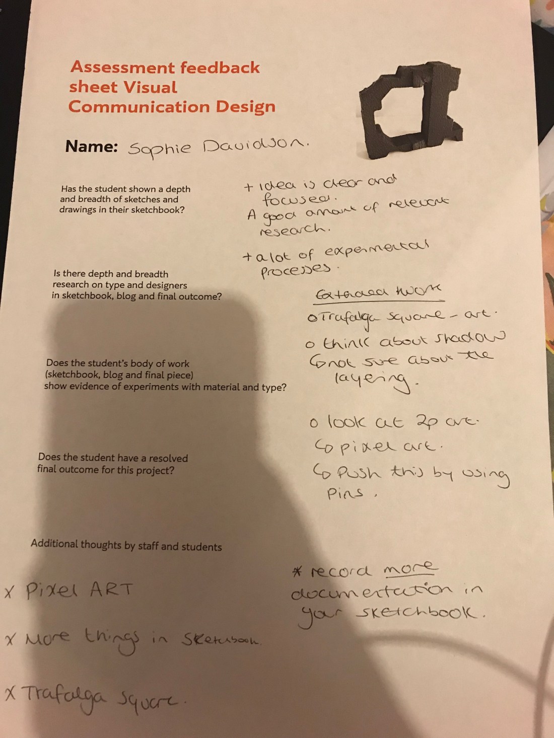
The main thing that I am going to focus on through the presenting stage, which I am going to work on tomorrow which is my self directed study, is make sure everything in my sketch book is up to date, so when I am moving onto the next subject I am not getting confused, and I am not falling behind more. I am also going to be doing some extra work for the visual communication pathway because I feel like this is the subject that I wanted to do before I started the foundation and I really enjoyed doing it. I am going to create different work in relation to graphics, and do some research about the subject and just record it in my sketch book.
A lot of people shared with me that I have a very clear idea, and that the design process was clear and also I have done a lot of work for this small two day project. I went above and beyond because I created a lower case, uppercase, numbers and even some symbols. This took me such a long time as each letter had to be individually edited on Photoshop.
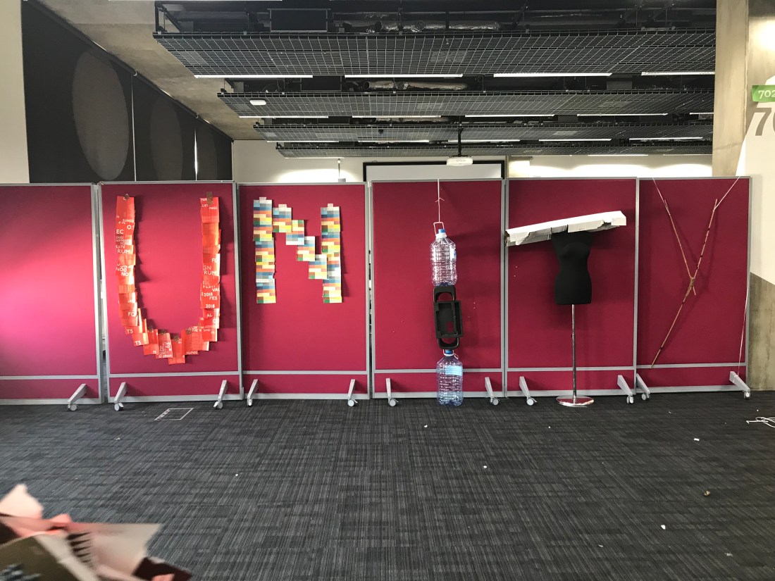
For the second half of the day with our presentation groups, we had to create an installation using a type face. Our group done the word ‘Unity’, with recycled materials. Below is the photograph of the final outcome:
Wednesday 12th September
Tuesday 11th September
Today was all about creating a campaign poster for something that we believe in. I thought about something that I am passionate about, and I thought about how I worked over my entire summer holidays, doing 8 hour shifts every day, with maybe 1 full day off a week, not even that. I felt proud of myself because I would be able to support myself financially when I started university, and so far I have.
This is my prototype:
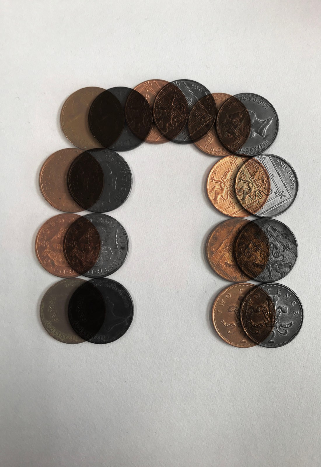
I really love this typography because it is suggesting that even the 2Ps should still matter towards money. I know that quite a lot of people just get rid of the 1Ps and 2PS, however if we collected them each time instead of throwing them on the ground or at the bottom of our bags, they could add up to a couple of quid a week maybe.
I really loved the opacity of the coloured image, because it shows that we can end up with a lot of 2PS if we saved us. I am going to be doing my entire typeface looking like the above photograph and editing each one induvuially which I am really looking forward too. I am going to be doing the uppercase lettering as I felt that this would be more effective. If I have time, which I am hoping that I will, I am going to do the lower case lettering as-well.
I have a lot of sketch book work to catch up on tomorrow, as I spent a little bit too much time researching into my idea, which may not have been the wisest choice to do. However, I am able to learn from my mistakes.
The designers I looked into was
Duane Dalton, Barbara Kruger and Andy Warhol. I am currently researching into a campaign called ‘Yeah, Kinda Rich’, which will be a page in my sketch book.
I am going to make sure that on my extended version of todays blog, that I will include copies of my sketch book work. I will be having a catch up day tomorrow.
Monday 10th September
Today was the first rotation day for the different subjects within ‘Design and Media’. Today was all about ‘Visual Communication Design’, which is one of my interests to go into when I pick a pathway, so I was very intrigued with this.
The session started off with explaining about what comes under ‘Visual Communication Design’, which were subjects that I didnt even think would be. It was interesting to know what pathways within ‘Visual Communication Design’, that there is aswell. I only really know about photography, and I really want to learn new things, so I am extremely excited for the progression of the course.
After the short presentation, we went off to find materials to create ‘Emotive Type’, I have documented everything from this session in my sketch book as-well. We had to create 3 3D or 2D (but at least one 3D) letter A showing different a different emotion. I did find this a little out of my comfort zone, as I haven’t ever done anything 3D before, as I very much digital, so I find this quite a challenge, as being put on the stop for this made it harder seen as I haven’t done 3D before. I did try my best, and I did actually enjoy doing it, it was so different than staring at a computer. I created 2 3D designs, and I am still currently working on my digital and drawing letter, I am doing an extra one as I wanted to experiment more.
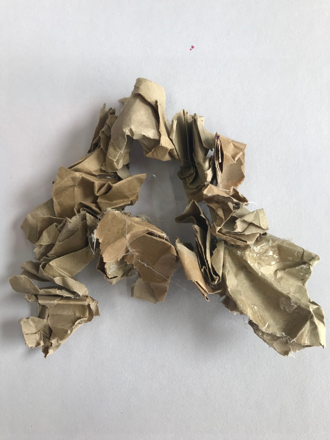
The photograph above was my first attempt at doing a 3D A. The emotion behind this was anger. It was anger because of the crumpled up paper, which is what some peoples faces look like when they are angry, and also some people feel the need to squeeze things, such as a stress ball, when they are angry to try and calm down. The brown colour paper shows the blank expressions that people give in anger, when they are trying not to show that they are angry.
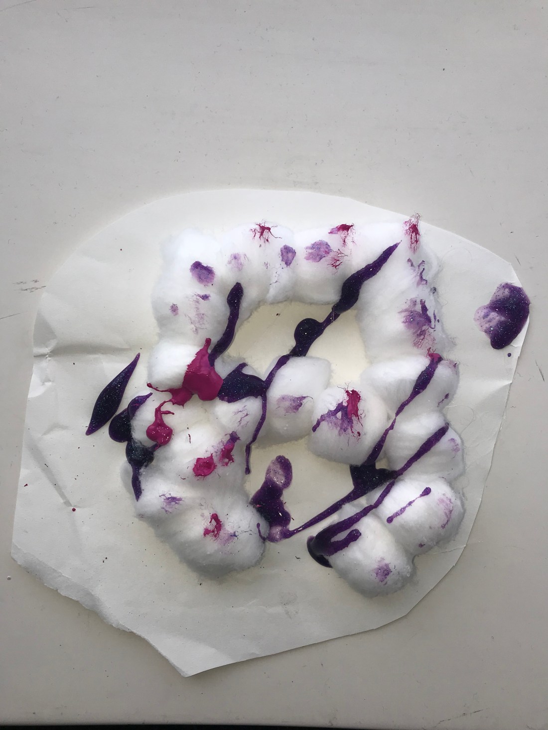
The photograph above was my second attempt at doing a 3D A. This letter A was to show the emotion surprise. This is shown through the surprise in the paints over the cotton balls, and that the paints have glitter, and mostly surprises use glitter as a symbol of trying to shock someone. I was using a hot glue gun to stick the cotton wool balls together, and they get stuck to a piece of paper underneath, and as it was involving a hot glue gun, and the cotton wool balls were small, I didn’t want to risk getting burnt so I kept the paper underneath. I was waiting for the paint to dry and then I was going to try and cut away the paper, but the paint didn’t dry in time, which was unfortunate.
I haven’t got the two other letters, but I will add a picture when they are complete.
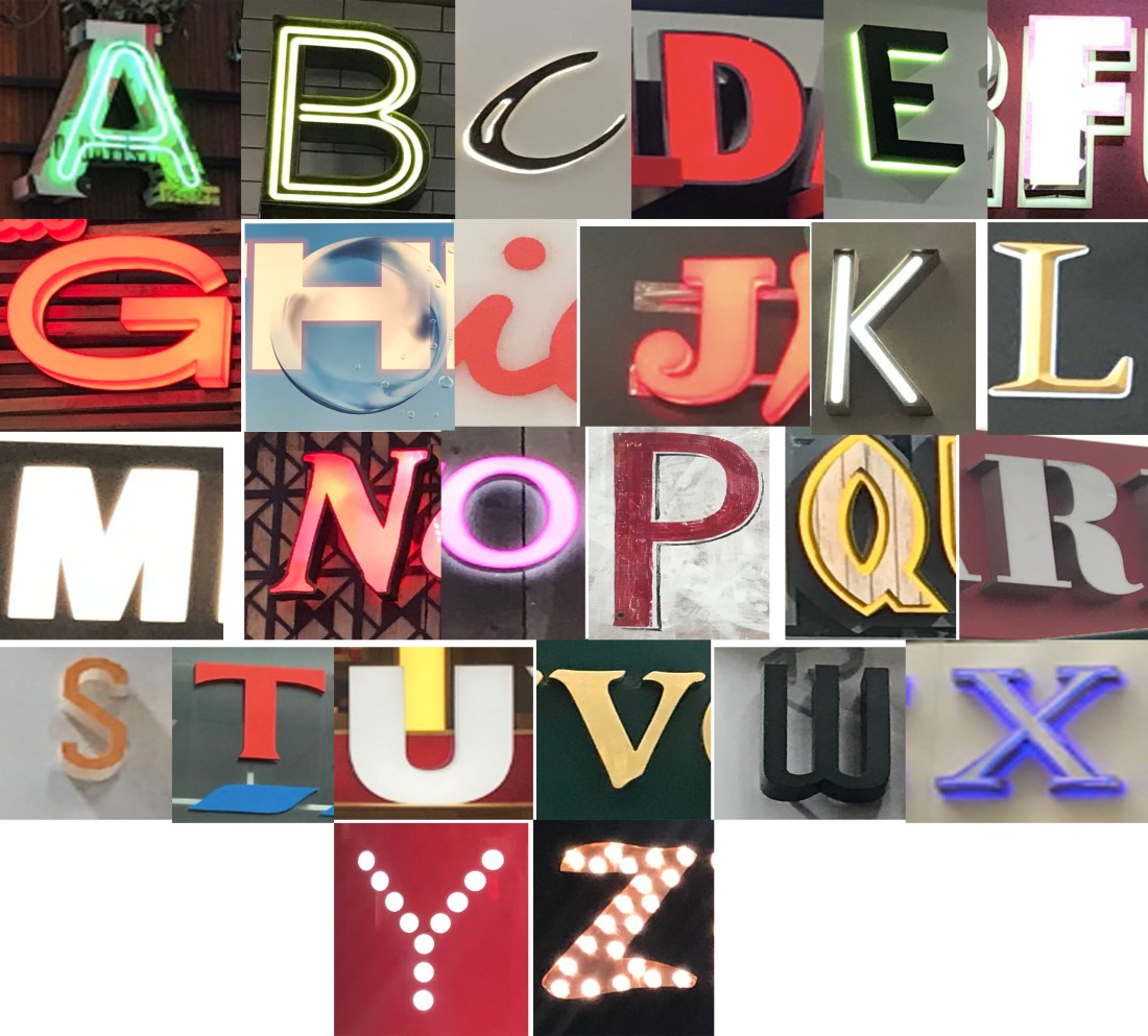
For the second session of the day, we done something called ‘Archive Type’, where we traveled around the area and photographing different fonts, letters numbers and symbols to create the alphabet, and having one font for each letter. I decided to take a picture of all the signs I could see, and when I got to picking the letters, I had a variety to choose from. I have included all of the photograph logo typography signs in my sketch book.
This is the final image collage of the alphabet font:
I have done a few edits on photoshop just as some experimentation, as I am considering this subject as a pathway so I wanted to do some extra work to build up my knowledge. There are a total of 6 different edits, but they have been grouped together to make the presentation of my blog easier.


I will also be doing numbers and symbols, doing some edits of them on photoshop too, and doing some research behind typography and the subjects that we covered today as I would like to expand my knowledge.
When all the work has been completed, I will be adding another blog page for all of todays work, but keeping it separate from tomorrows sessions work. The titles will be separate too.
Friday 6th & The Weekend
During the self directed day on Friday, I caught up with the few pages that were missing, and I done a research page with some sketches as-well. I am a really poor drawer, but I wanted to give it a go as I am attempting to learn how to draw in my own time, as I do like to draw, I have just not got a clue how to draw properly.
I have already included this photograph on my previous day blog, however, this is my final piece because I am just so drawn to it.
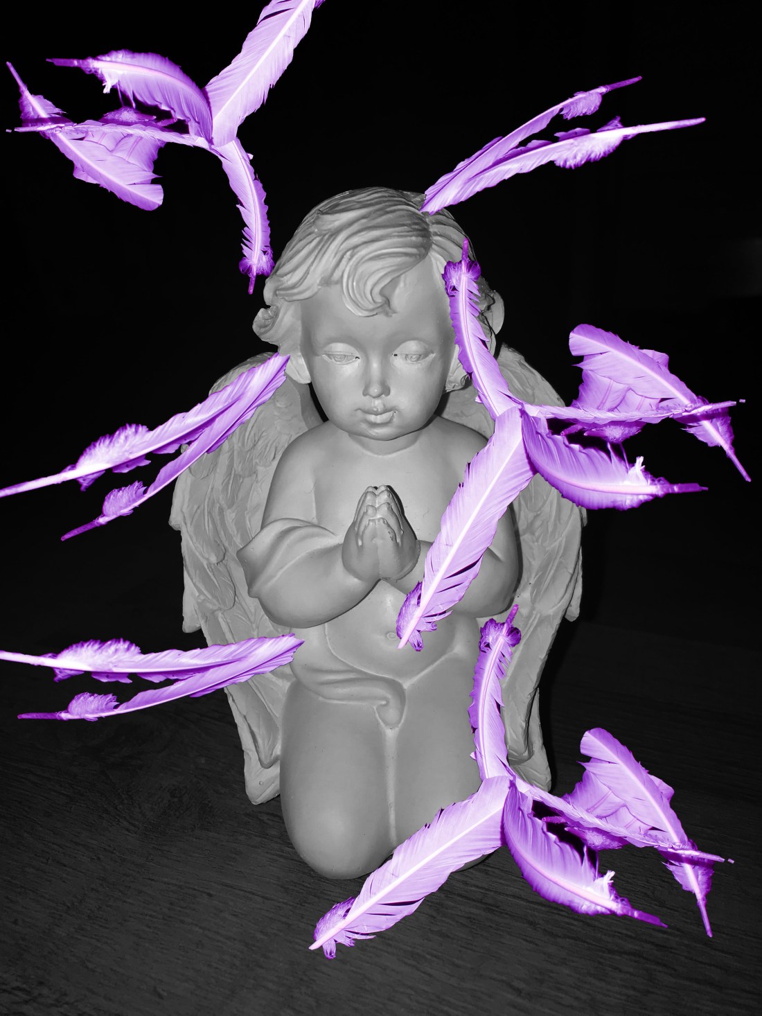
I absolutely love the purple feathers as it really makes the photograph pop with the black and white background, and the angel standing up looks a lot better than the other angel photographs that I had.
the meaning behind the photograph, relating to the theme of ‘Descent’, is how the descending of feathers from the sky, is a communication message from the angels to talk to us, guide us and support us in every day challenges and struggles.
Thursday 6th September
Today was an independent study day. I went into the university to be able to continue with all my work. I was able to complete the majority of it apart from a few gallery visits in my sketchbook which I am quite pleased about.
I was doing quite a lot of development over photoshop, and I will continue to do some tonight and stick them in my sketch book tomorrow. Through all the development, I think I have created my final piece, which I am extremely happy with because it looks like such an interesting piece of work.
The piece that I have fallen in love with is this one:
I love this photograph because it is showing exactly what my concept is about, my concept is about how when feathers fall to the ground from the sky, it is our angels trying to communicate with us, guide or support us, or is letting us know a past loved one is safe. They are normally white feathers, but I know in the angel community that the colour purple is a very powerful sign.
Another photograph that I had was this one:
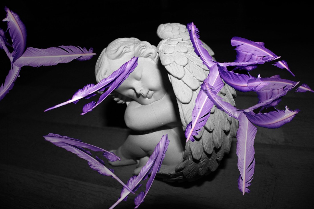
I did quite like this one, but with the angel sitting down and the positioning of it, I didn’t think it looked as effective as my potential final piece did. However, I really did enjoy creating these from my own photographs on photoshop.
All the photographs that I have used to create these photographs were all photograph I took myself.
Wednesday 5th September
Today was a trip up to London to see some galleries. It was a very interesting day looking at different photography pieces as I felt like I connected with the experience more because I am very familiar with photography,
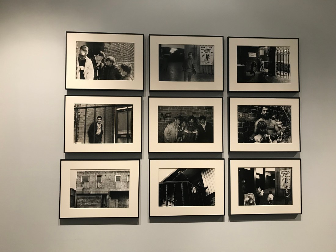
The first gallery I went too was ‘The Photographers Gallery’, which is near Oxford Circus. There was a specific exhibition which was all black and white photography, it was across an entire floor and it was from a photographer called ‘Trish Murtha’. Although I am able to connect easily with photography, I did find Murtha’s work quite hard, only because it was quite a challenging concept, and I found it hard to connect with the singular pieces of photography, which is actually very unusual for me. I felt like her work connected with the theme ‘Descent’, because through some of the pieces of her work, I felt like there was a continuous theme of the descending society which is shown through the backgrounds, where the children are playing. I found it interesting that through the events of society and culture, that the children were still playing, seeming happy.
There was a piece of work that really confused me which I have included below. This is because the collection of photographs has a sense of theme which includes people, and the contrast is quite low. However, in the bottom left hand corner there is a picture of a garage, and the contrast is quite high. I felt as if this photograph is extremely out of place.
My group and I went to ‘The Brick Lane Gallery’, which I found quite interesting, and I did collect some leaflets that I have stuck into my sketch book. It was a very tiny gallery, I think it could be for new artists, I am not too sure. However, the theme felt very fantastical which I really connected with on a personal level.
We did travel to a gallery called ‘Calvert 22’, however when we got to the gallery, we were told it was closed due to the changing in exhibitions. Then we decided to travel to Parasol Unit Foundation for Contemporary Art, which was also closed.
The last gallery we went too was ‘Autograph Gallery’. This was quite interesting to gain different perspective of how different people with different cultures go on their life. I was intrigued by it all. However, I am unable to feed it into my descent project, so I may be able to include it throughout the year.
Since getting home from London, I have planned out my sketch book, and wrote a to do list of the pages I need to complete for tomorrows independent study before the deadline on Friday.
